20 Watercolor Background Ideas for Stunning Art & Designs
Introduction
There is something uniquely alive about a watercolor background. The way pigment blooms across wet paper, the soft edges that seem to breathe, and the unpredictable beauty that no other medium quite replicates — watercolor backgrounds have captured the imagination of artists, designers, and creatives for centuries. Whether you are painting a botanical illustration, designing a wedding invitation, filling pages in your art journal, or creating digital assets inspired by traditional media, a well-crafted watercolor background sets the entire tone of your work.
Yet, for many artists, the background is the most intimidating part. It is the foundation upon which everything else rests, and getting it wrong can throw off an entire composition. The good news is that watercolor backgrounds are far more forgiving than they appear. With the right techniques, even beginners can create effects that look professional, atmospheric, and deeply expressive.
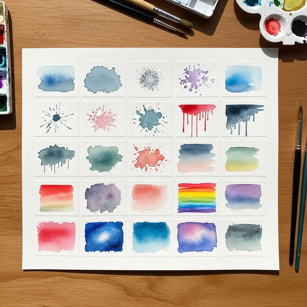
This article walks you through 20 watercolor background ideas, from simple washes to layered texture-building methods. Each idea is practical, accessible, and rich with creative potential. Whether you are picking up a brush for the first time or looking to expand your existing repertoire, there is something here for every skill level and creative goal.
1. The Classic Flat Wash
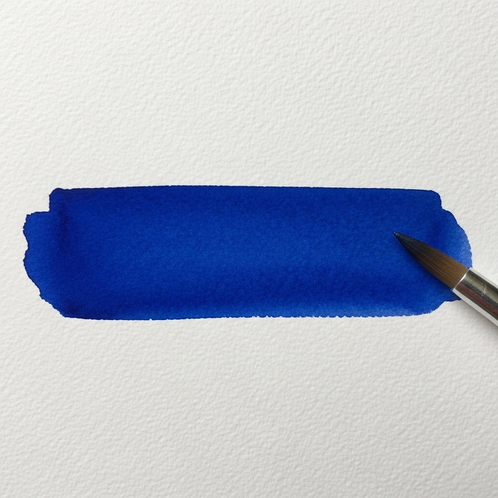
The flat wash is the most fundamental of all watercolor background ideas. It involves loading your brush with a single, consistent color diluted with water and sweeping it across the paper in even horizontal strokes. The goal is an unbroken field of color with no visible variation in tone or value. While it sounds simple, mastering the flat wash requires attention to water-to-pigment ratio, brush pressure, and working speed. A well-executed flat wash creates a serene, minimalist backdrop that allows foreground subjects to take full visual command. It is especially powerful behind detailed botanical art or fine line illustrations.
2. The Graded Wash
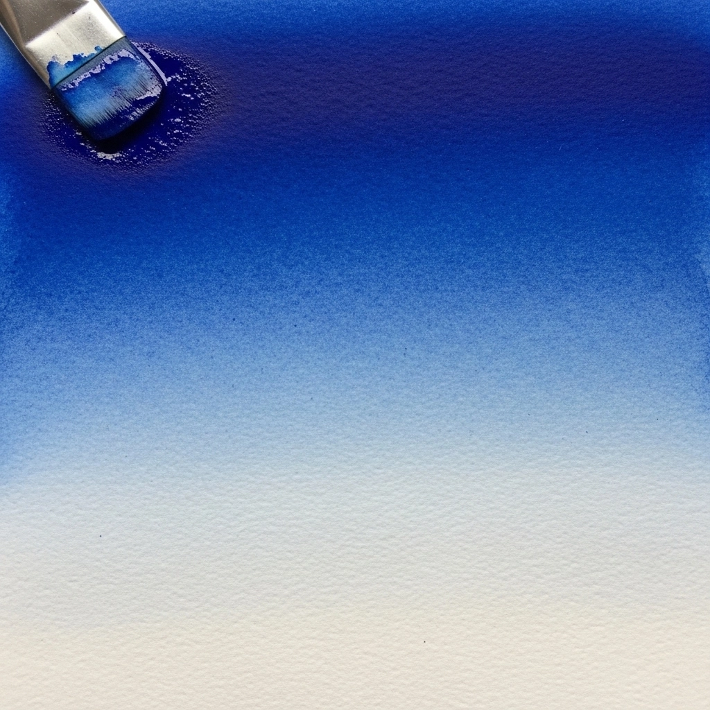
A graded wash transitions smoothly from a deep, saturated tone at one edge to a near-transparent tint at the other. This effect mimics natural light transitions found in skies, water, and misty landscapes. To create it, start with a heavily pigmented mix at the top of your paper, adding more water to your palette with each successive stroke as you move downward. The result is a luminous background that feels dimensional without requiring any additional elements. Graded washes work beautifully as backgrounds for lettering projects and hand-stamped designs.
3. Wet-on-Wet Soft Blooms
Wet-on-wet is one of the most beloved techniques in all of watercolor painting, and it produces some of the most stunning backgrounds imaginable. The technique involves wetting your paper thoroughly with clean water first, and then dropping or painting color directly onto the damp surface. The paint spreads organically, creating soft-edged blooms and seamless color merging that is impossible to replicate with any other approach. The key is not to overwork the surface. Allow the pigment to move freely and resist the temptation to manipulate it with your brush. The results are ethereal, atmospheric, and deeply satisfying.
4. Wet-on-Dry Controlled Layers
While wet-on-wet produces organic softness, the wet-on-dry method gives you considerably more control. Here, you apply wet paint to a completely dry paper surface. The edges of each stroke remain crisp and defined, allowing you to build deliberate shapes, gradients, and layered tones with precision. Wet-on-dry backgrounds work well in architectural illustration and graphic design-inspired watercolor work where clean geometry matters. Layering multiple transparent washes using this method builds depth gradually without muddying the colors beneath.
5. Salt Texture Effects
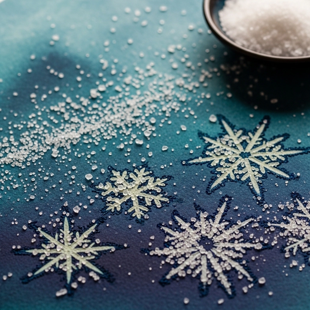
Salt is one of the most accessible and dramatic tools in a watercolor artist’s toolkit. When ordinary table salt, sea salt, or kosher salt is sprinkled onto a wet wash, each crystal absorbs moisture and pulls pigment toward it, leaving behind pale, starburst-like marks surrounded by darker color concentration. The result looks organic, textural, and visually complex, yet it costs almost nothing to achieve. Table salt produces fine, delicate patterns, while coarse sea salt creates bold, irregular bursts. The timing of application matters greatly — the wash should still be shimmering but not pooling. Once the surface dries completely, brush the salt away to reveal the texture underneath. Salt backgrounds are especially effective for night skies, underwater scenes, and abstract art.
6. Alcohol Drop Technique
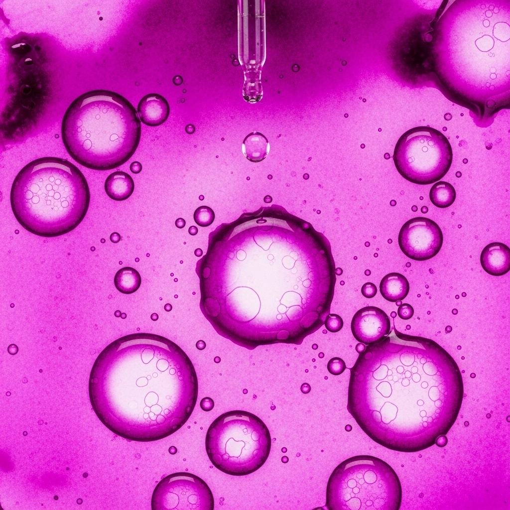
Rubbing alcohol, when dropped or spritzed onto a wet watercolor wash, repels pigment and creates circular, lacy patterns with bright centers and darker outer rings. This technique produces effects that resemble cells, bubbles, soap film, or abstract cosmic imagery. It is highly popular among mixed media artists and those who create art journal pages. The size of the circles depends on how much alcohol you apply — a dropper gives you large, dramatic circles, while a fine mist produces a field of tiny bubbles. This is a wonderfully unpredictable method that rewards experimentation.
7. Plastic Wrap Texture
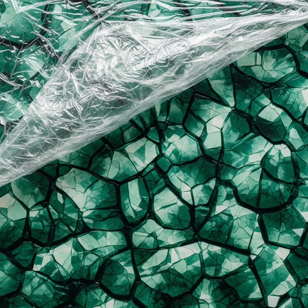
Placing crumpled plastic wrap over a freshly painted wet wash and pressing it gently into the surface creates a richly faceted, crystalline texture once the paint dries. The plastic traps moisture unevenly, causing the pigment to collect along the folds and creases. When the wrap is removed after the paint has dried fully, you are left with a background that looks almost geological, reminiscent of cracked ice, weathered stone, or abstract landscapes. This technique requires patience, as you must wait for complete drying before lifting the plastic. The results are consistently spectacular.
8. Wax Resist Backgrounds
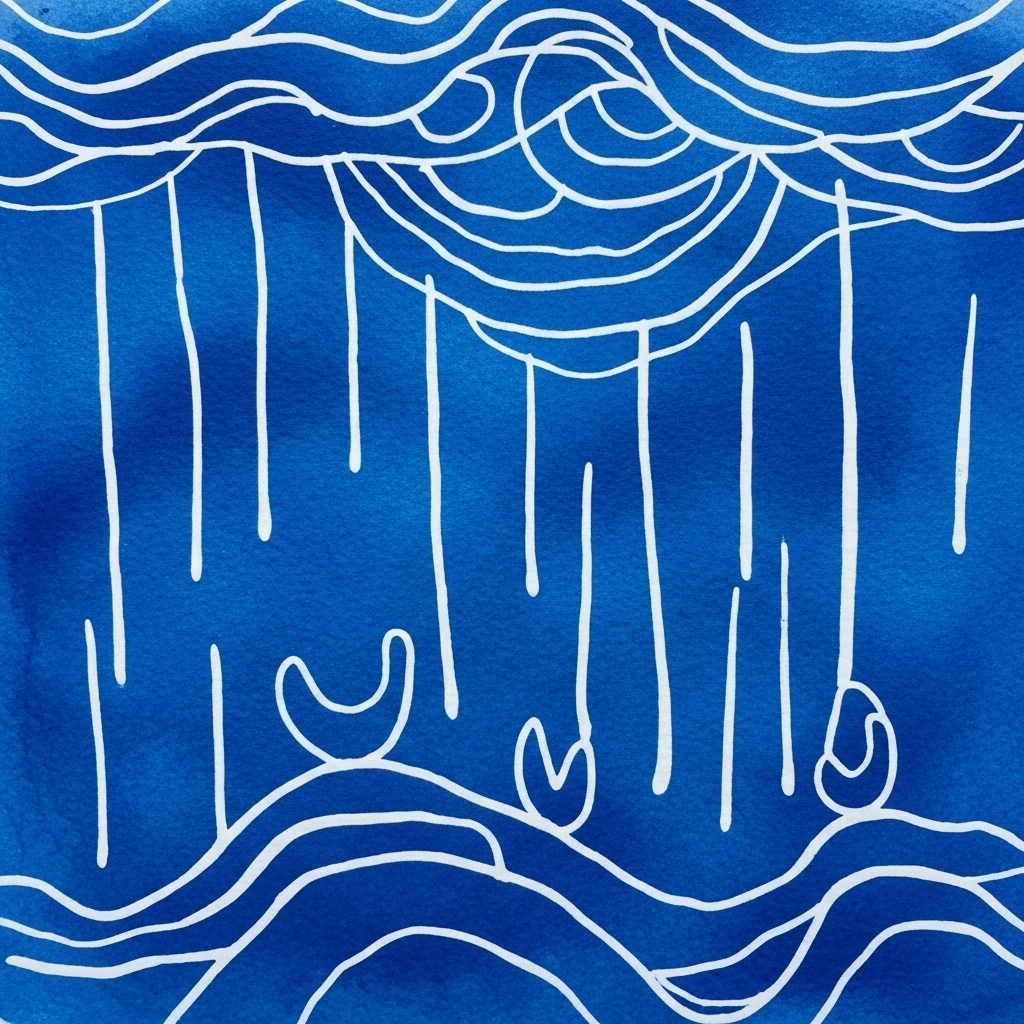
Wax, being waterproof, refuses to accept water-based paint. This property makes ordinary white candles and wax crayons powerful tools for creating resist patterns in watercolor backgrounds. Before applying any paint, draw lines, shapes, or patterns on your paper with a wax candle or crayon. When you paint over the surface, the wax areas repel the pigment, revealing the drawn marks as bright, unpainted spaces within the colored wash. This technique is excellent for creating the impression of rain, waves, foliage, or abstract geometric patterns. The effect has a pleasingly handmade, layered quality that feels rich and intentional.
9. Masking Fluid Resist
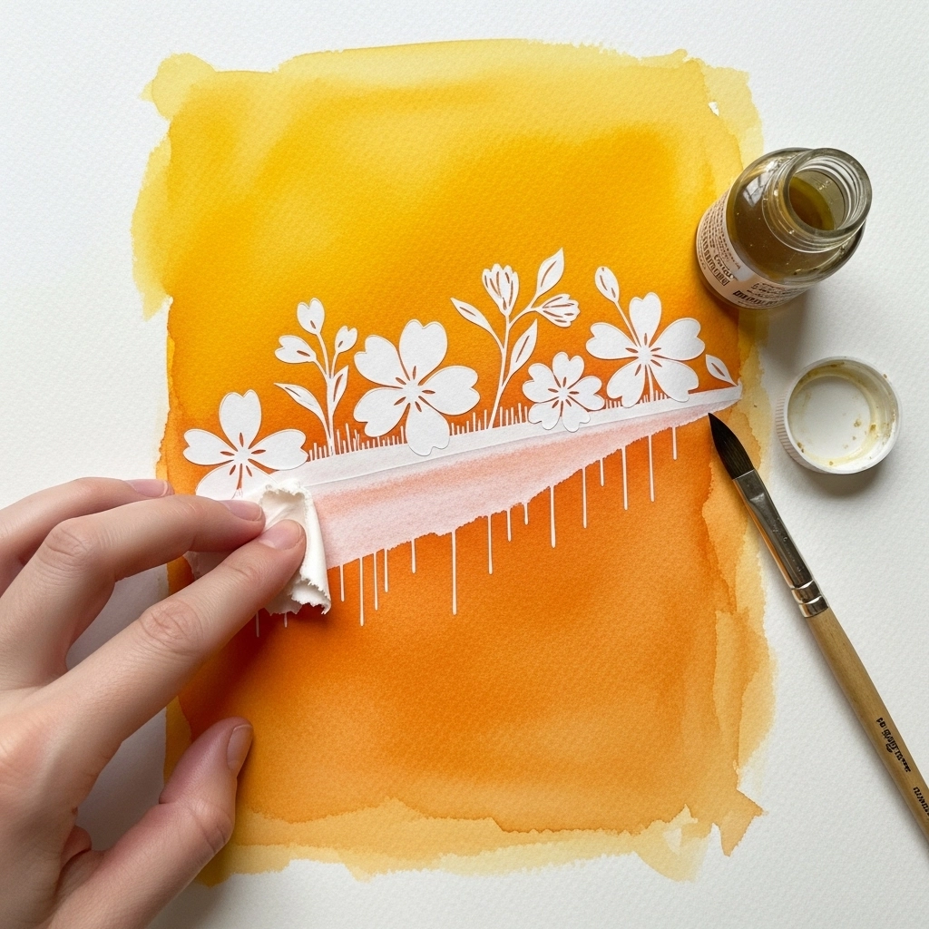
Masking fluid, also known as liquid frisket, is a liquid latex product that protects specific areas of your paper from paint. Apply it with an old brush or a ruling pen to any area you want to keep white or preserve for later painting. Once the masking fluid dries, it forms a rubbery barrier. Paint freely over the entire surface, including over the masked areas. When the wash dries completely, rub away the masking fluid with a clean finger or eraser to reveal crisp white shapes beneath. This technique gives you incredible precision and allows you to create complex negative space effects, fine line patterns, and detailed highlights within a richly painted background.
10. Splatter and Spatter Backgrounds
The splatter technique injects energy, movement, and spontaneity into any background. Load a brush heavily with pigment and either flick it toward the paper or run your finger across the bristles to release a spray of tiny droplets. A stiff-bristled brush or even a toothbrush works well for this. The result is a field of irregular dots and droplets that suggest motion, texture, or atmosphere. Splatters work beautifully as standalone backgrounds or as finishing layers over existing washes. They are widely used in children’s illustration, abstract art, and galaxy-themed designs. Protect surrounding areas with masking tape before you begin.
11. Color Gradient Rainbow Wash
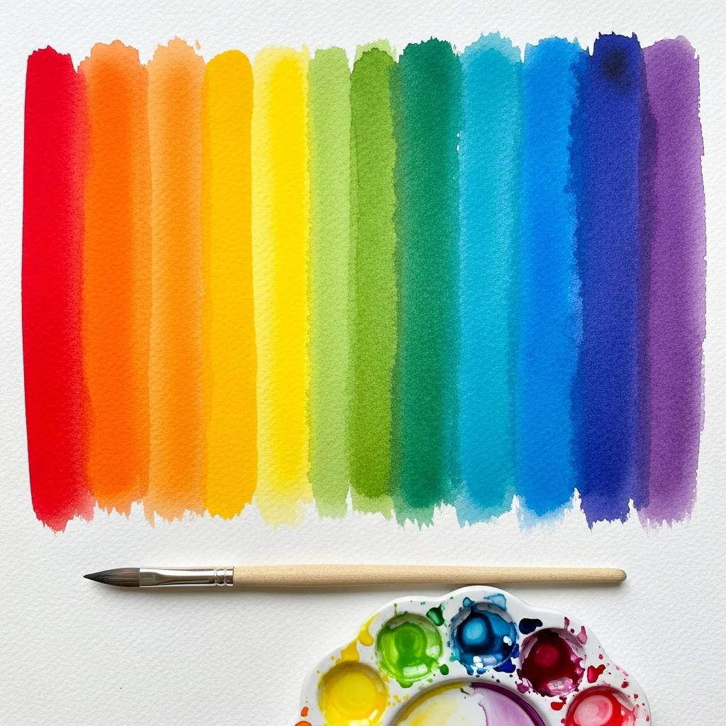
A rainbow wash background transitions through multiple colors in sequence, creating a vibrant, joyful backdrop that works exceptionally well for hand lettering, greeting card design, and art journaling. The key to a successful rainbow wash is ensuring that the paper remains wet as you move from one color to the next, allowing each transition zone to blend naturally. Work from light to dark values, or follow the spectrum from warm to cool tones. Keep your brush clean between colors to prevent muddiness in the transition zones. This background type is among the most recognizable and commercially popular watercolor looks in modern design.
12. Negative Space Backgrounds
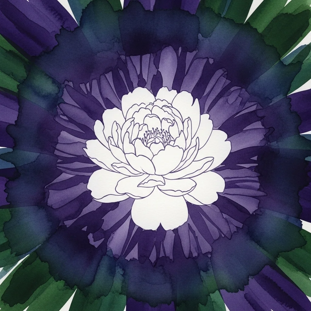
Negative painting involves building a dark or mid-tone background around a light subject, rather than painting the subject itself. The subject is defined entirely by the painted space that surrounds it. This technique creates hauntingly beautiful backgrounds in which the subject seems to glow with an inner light. Flowers, foliage, and architectural forms work particularly well with this approach. Multiple layers can be built up around the edges of the subject, pushing the background progressively darker while the subject remains luminous and untouched. Negative painting requires careful planning but produces results of extraordinary visual impact.
13. Straw Blowing Technique
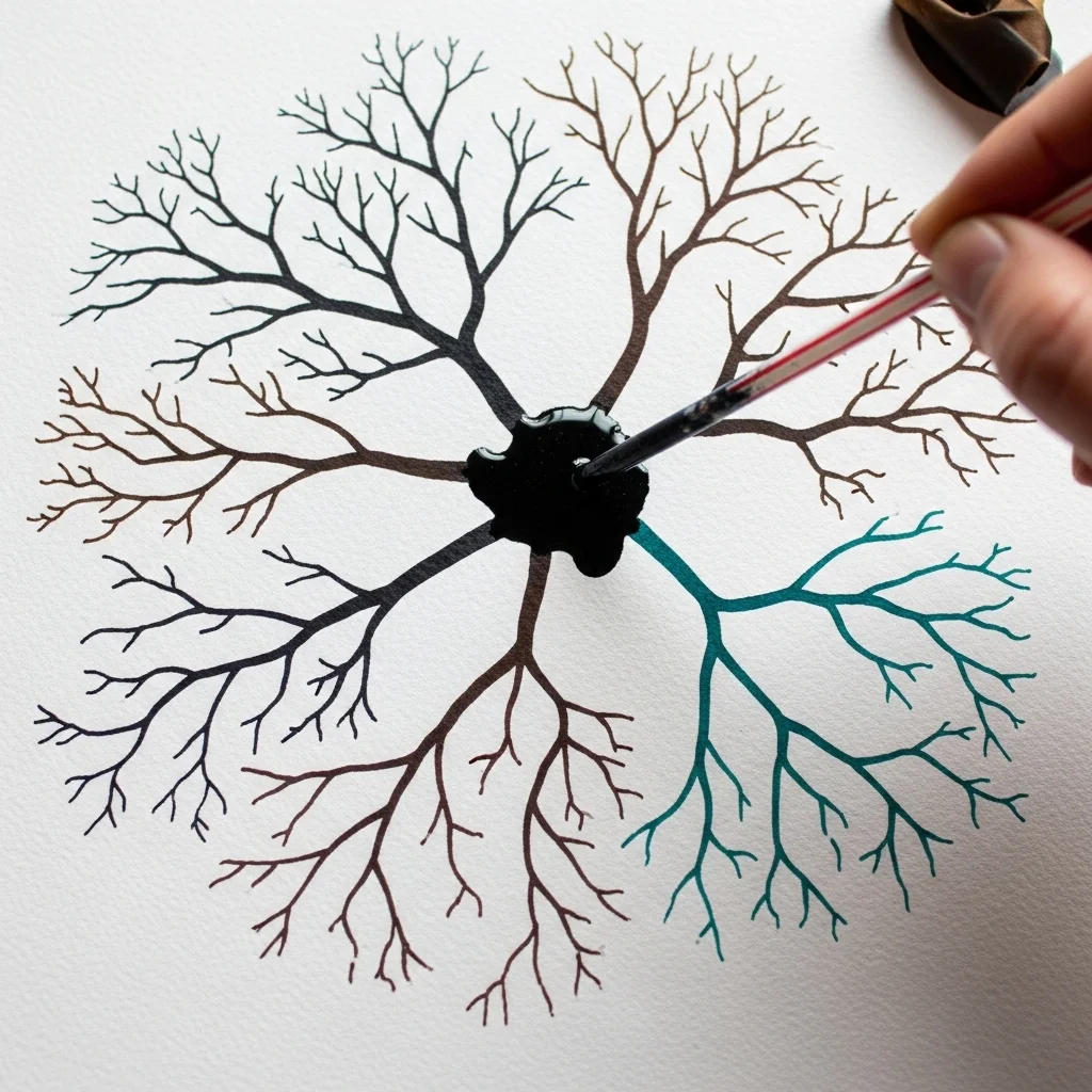
Dropping a small pool of heavily diluted paint onto your paper and then blowing it with a short straw creates wild, branching lines that resemble bare tree branches, lightning, coral formations, or abstract roots. The direction and force of your breath controls the path of the paint. This is a wonderfully playful technique that produces dramatically organic results with minimal skill required. It is a popular choice for art journal backgrounds and mixed media pages. You can layer multiple colors using this method, blowing each one in a slightly different direction to create depth and complexity.
14. Drip and Tilt Backgrounds
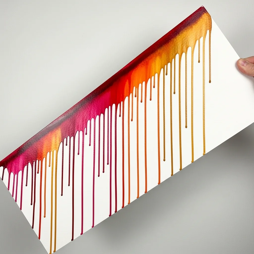
Loading your brush with an abundant amount of water and paint and applying a thick line across the top of your paper, then tilting the surface so the paint runs downward, creates dramatic vertical drip effects. You can control the width and spacing of the drips by adjusting the angle of the paper and the amount of liquid you apply. Blotting the bottom edge with a paper towel prevents unwanted pooling. Multiple colors applied in sequence can produce a richly layered drip background with beautiful color interactions where the streams overlap and blend.
15. Dry Brush Texture
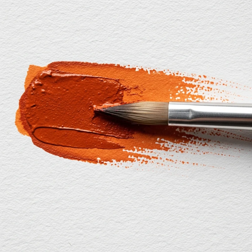
Dry brushing involves using a brush that carries relatively little water and dragging it quickly across rough watercolor paper so that paint catches only on the raised peaks of the paper’s texture. The result is a broken, scratchy mark with white gaps that suggest roughness, age, and surface complexity. Dry brush backgrounds are outstanding for depicting wood grain, stone, aged paper, grass, fur, or water reflections. They are also useful as final texture layers over existing washes to add visual interest without obscuring the colors beneath. This technique works best on rough or cold-pressed watercolor paper.
16. Layered Transparent Washes
One of the fundamental strengths of watercolor is its transparency. Building up multiple thin, transparent layers, allowing each one to dry fully before applying the next, creates backgrounds of extraordinary depth and luminosity. Each layer subtly shifts the tonal value and color saturation, and the cumulative effect is far richer than anything achievable in a single application. This glazing approach is especially powerful for creating dark, moody backgrounds where depth seems to recede endlessly into the surface. Artists working in the classical realist tradition rely heavily on layered washes to achieve backgrounds of complex tonal subtlety.
17. Sponge-Applied Backgrounds
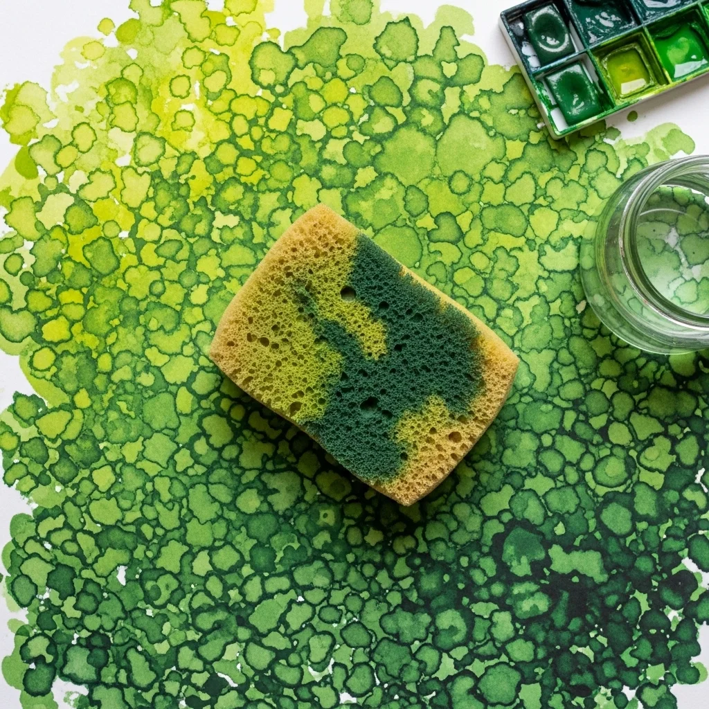
Using a natural or synthetic sponge instead of a brush to apply watercolor creates a rich, mottled texture that is difficult to replicate with any other tool. Dip the sponge into your paint mix and dab or press it across the paper surface. The irregular cell structure of the sponge leaves behind an organic, varied mark. This technique is excellent for creating the impression of foliage canopies, mossy ground, clouds, or abstract textured fields. Natural sea sponges produce the most visually interesting marks due to their irregular pore structure. Combine sponge work with brush washes for layered complexity.
18. Stencil and Watercolor Backgrounds
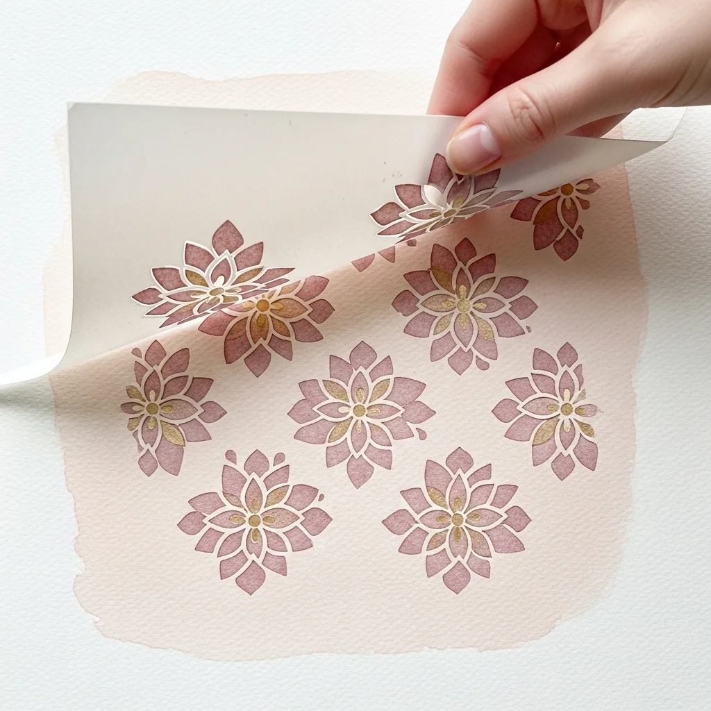
Stencils bring structure and pattern control to watercolor backgrounds without requiring any drawing skill. Lay a stencil flat on your paper, then apply diluted watercolor over it with a brush, sponge, or even a spray bottle. The paint bleeds slightly under the stencil edges, which in watercolor gives a pleasingly soft and imprecise quality quite different from the hard edges you get with acrylics. Floral, geometric, lace, and mandala stencils are all popular choices. After removing the stencil, the remaining background has a repeating motif embedded within the wash, creating a background that feels both designed and painterly at the same time.
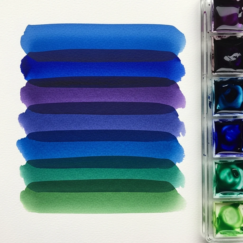
19. Two-Color Blended Backgrounds
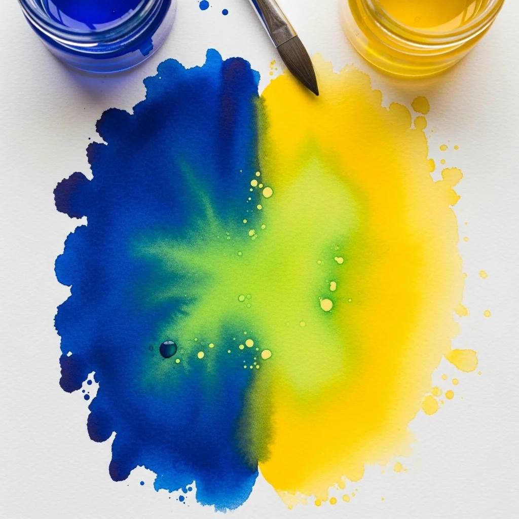
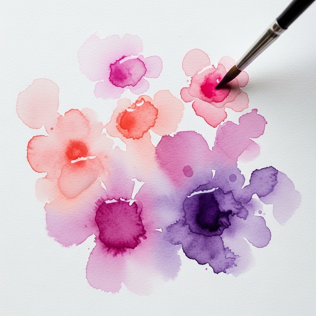
Blending two contrasting or complementary colors in a single wet wash creates backgrounds with incredible visual tension and beauty. Apply the first color on one side of your paper, the second color on the other, and blend them together in the middle while the surface is still wet. Colors that sit close together on the color wheel, such as blue and violet or yellow and orange, produce harmonious transitions. Colors directly opposite on the wheel, such as red and green, can produce rich, earthy neutrals where they mix. The key is keeping the paper wet enough for natural blending, while working quickly enough that neither color has time to dry before they meet.
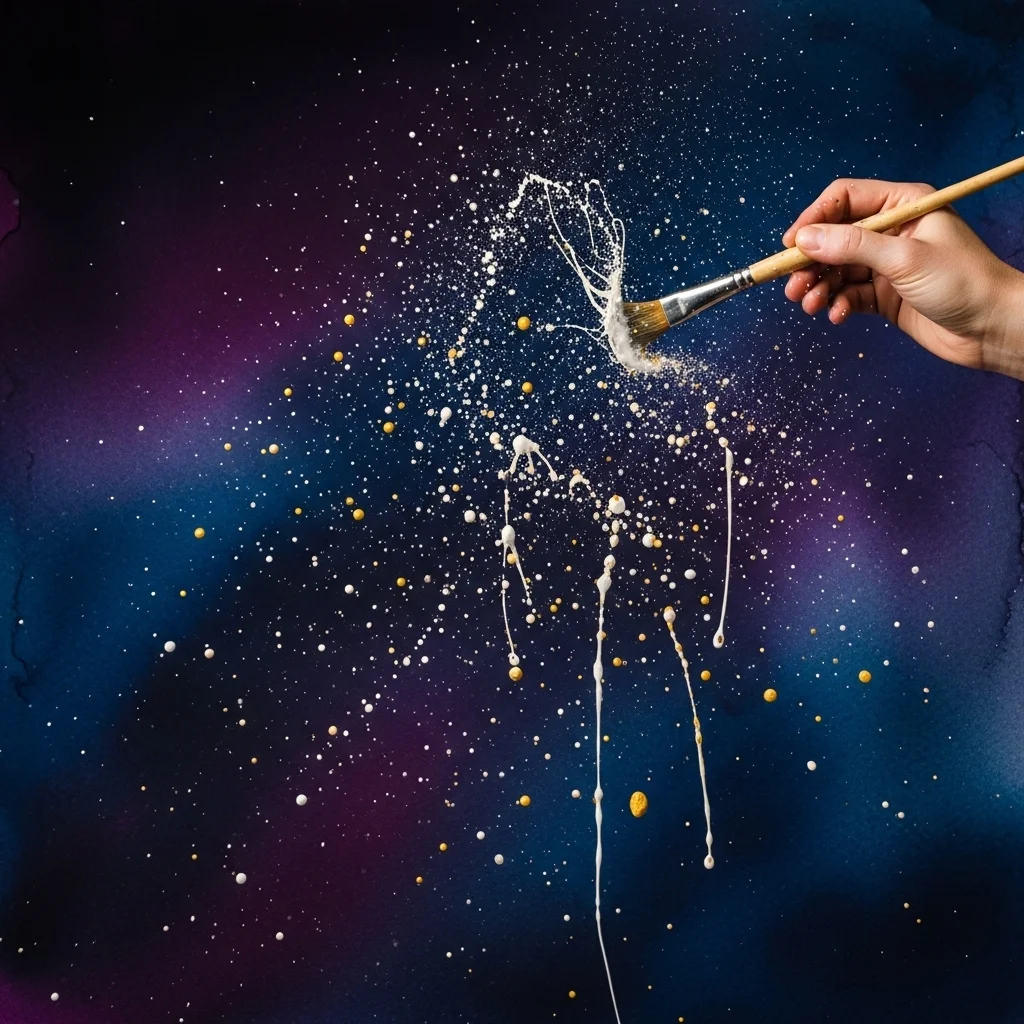
20. Abstract Galaxy and Night Sky Backgrounds
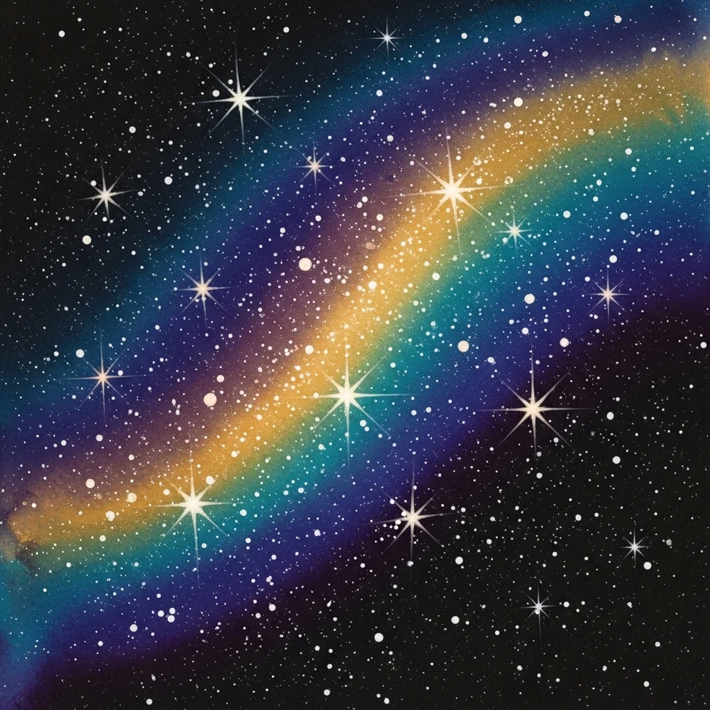
Galaxy and night sky backgrounds have become among the most widely admired watercolor background ideas in contemporary art and design. They combine several techniques in one composition: a deep, multi-toned wet-on-wet wash in dark blues, purples, and black forms the base. Salt is then scattered across the wet surface to create the illusion of stars and distant light sources. White gouache or a white gel pen adds bright star points and sweeping nebula highlights once the background dries. Splatters of white paint add further depth. The final result is a background of breathtaking atmospheric quality, full of movement, mystery, and scale. This type of background is in high demand for phone cases, notebooks, greeting cards, and fine art prints.
Choosing the Right Paper and Supplies
No technique, however skillfully applied, will produce its best results without appropriate materials. Watercolor paper is sold in three surface textures: hot press (smooth), cold press (slightly textured), and rough (heavily textured). Cold press is the most versatile and widely recommended for background work. Paper weight matters too — 140lb or 300gsm paper is the minimum recommended weight to prevent excessive warping and buckling when water is applied. Cotton-fiber papers such as Arches absorb water smoothly, allowing washes to flow more evenly and lift more cleanly than cellulose papers. For brushes, a large flat or round brush in size 10 or 12 is ideal for covering background areas efficiently.
Preparing Your Paper
Stretching or taping your paper to a board before painting significantly reduces warping and buckling. Secure the edges with painter’s tape or gummed tape, or soak the paper and stretch it on a wooden board before it dries. This small preparation step makes a major difference in the smoothness and control of your backgrounds, particularly for large wet-on-wet washes.
Conclusion
Watercolor backgrounds are not merely decorative fillers. They are the emotional and compositional foundation of your artwork, capable of setting tone, suggesting atmosphere, and communicating mood before a single foreground element is added. The 20 watercolor background ideas covered in this article represent a broad spectrum of approaches, from the meditative simplicity of a flat wash to the dramatic spectacle of a galaxy background built from layered techniques.
The most important principle in all of this is experimentation. Watercolor rewards those who are willing to play, to observe, and to learn from the unexpected outcomes that this beautifully unpredictable medium delivers. Keep a sketchbook specifically for testing background techniques, maintain notes on what works and what does not, and return regularly to methods that surprised you. Over time, you will develop an intuitive vocabulary of background choices that inform every piece you create.
Whether you are a hobbyist filling journal pages or a professional preparing assets for print and publication, mastering watercolor backgrounds will elevate every piece of work you produce. Begin with the simplest ideas, build your confidence, and then venture into the more complex and layered techniques as your skills grow. The paper is waiting.
Frequently Asked Questions
1. What is the best watercolor paper for painting backgrounds?
Cold press watercolor paper weighing at least 140lb or 300gsm is the most widely recommended choice for background work. It offers enough texture to hold paint interestingly without being too rough for smooth washes. Cotton-based papers such as Arches or Fabriano Artistico are preferred by professional artists because they absorb water more evenly and allow easier lifting and correction. For beginners, a decent student-grade cold press pad will serve the purpose well while skills are developing.
2. Can a complete beginner create beautiful watercolor backgrounds?
Absolutely. Many of the most visually impressive watercolor background techniques, such as salt texture, wet-on-wet blooms, and plastic wrap texture, require very little drawing or painting skill. They rely on the natural behavior of water and pigment rather than brushwork mastery. Beginners can achieve professional-looking results from their very first session by starting with these process-driven methods and gradually building toward more controlled approaches.
3. Should I paint the background first or the subject first in watercolor?
There is no single correct answer, and both approaches are used by skilled artists. Painting the background first gives you freedom to lay down broad washes without worrying about covering the subject. It also helps establish the overall mood of the piece early on. You can use masking fluid or painter’s tape to protect the subject area while painting the background. Painting the subject first, then filling in the background, works well for more controlled, detail-oriented compositions. Experimenting with both approaches will help you discover which suits your working style.
4. Why does my watercolor background look muddy or uneven?
Muddiness usually results from overworking the paint while it is drying, using too many conflicting pigments that neutralize each other, or applying a new layer before the previous one has dried fully. The best prevention is to mix clean colors in advance, apply them decisively, and allow each layer to dry completely before touching the surface again. Unevenness in flat washes is often caused by inconsistent water-to-pigment ratios or painting too slowly, which allows earlier strokes to begin drying before the wash is complete.
5. How can I use watercolor backgrounds in graphic design and digital projects?
Watercolor backgrounds created on paper can be scanned at high resolution and used directly in digital design projects. Scanning at 300dpi or higher gives you a clean, high-quality file suitable for print. Once digitized, backgrounds can be colored-adjusted, layered over text, and combined with digital illustrations in programs such as Adobe Photoshop or Illustrator. They are widely used for wedding stationery, book covers, social media content, poster design, and branding materials. The organic quality of a real watercolor background adds warmth and authenticity to digital designs that digital filters simply cannot replicate.