14+ Creative Pink and Purple Painting Ideas to Try
Introduction
Pink and Purple Painting Ideas Few color combinations in the world of painting carry the emotional range and visual beauty of pink and purple together. These two colors share a common ancestry on the color wheel, both rooted in red, which means they naturally harmonize without effort or conflict. When placed side by side on a canvas, they produce something that feels simultaneously soft and vibrant, calm and energetic, romantic and bold.
Whether you prefer the transparency of watercolors, the fast-drying flexibility of acrylics, or the slow luxurious blending of oil paints, pink and purple work beautifully across every medium. Artists of all skill levels gravitate toward this pairing because the results look impressive without requiring years of technical training. The palette lends itself to sunsets, galaxies, flowers, forests, seascapes, and abstract compositions with equal success.
This article presents 15 deeply explored pink and purple painting ideas that you can start working on today. Each idea comes with enough creative direction and technique insight to help you approach your canvas with clarity and confidence. Whether you are decorating your home, building your portfolio, or simply spending a creative afternoon, these ideas will give you everything you need to make something beautiful.
1. Pink and Purple Sunset Landscape
A sunset landscape remains one of the most timeless and rewarding subjects any painter can choose, and the pink and purple color family makes it feel particularly alive and atmospheric. The natural progression of a dusk sky moves from deep violet at the top through bright magenta and warm rose toward the glowing horizon line, making this subject a natural fit for exactly these two colors.
When working in acrylics, load a large flat brush with deep violet and lay it across the top third of your canvas. Without cleaning the brush fully, pick up a pure magenta and blend it into the lower edge of the violet band, working with long horizontal strokes. Continue pulling color downward through rose and soft pink tones until you reach the horizon. The key is to keep your brush slightly damp and to blend while the paint is still wet to avoid hard lines between color zones.
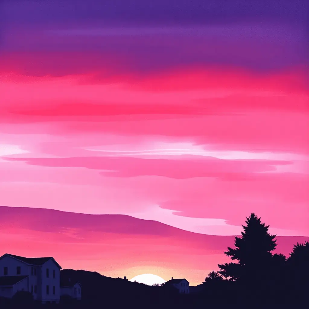
For a watercolor sunset, wet the entire paper surface first with clean water, then drop in your concentrated pigment and let it spread and bloom naturally across the page. Gravity and water will do much of the blending for you. Once the background is dry, add a simple silhouette of trees, rolling hills, or rooftops at the base of the composition. This grounding element gives the painting a sense of place and gives the viewer’s eye somewhere to settle.
2. Abstract Fluid Art with Pink and Purple
Fluid painting is one of the most exciting and accessible art forms available today, and pink and purple are two of the most popular colors chosen by fluid artists around the world. In this technique, acrylic paint is mixed with a pouring medium until it reaches the consistency of warm honey and then poured directly onto the canvas in layers that flow and intermingle on their own.
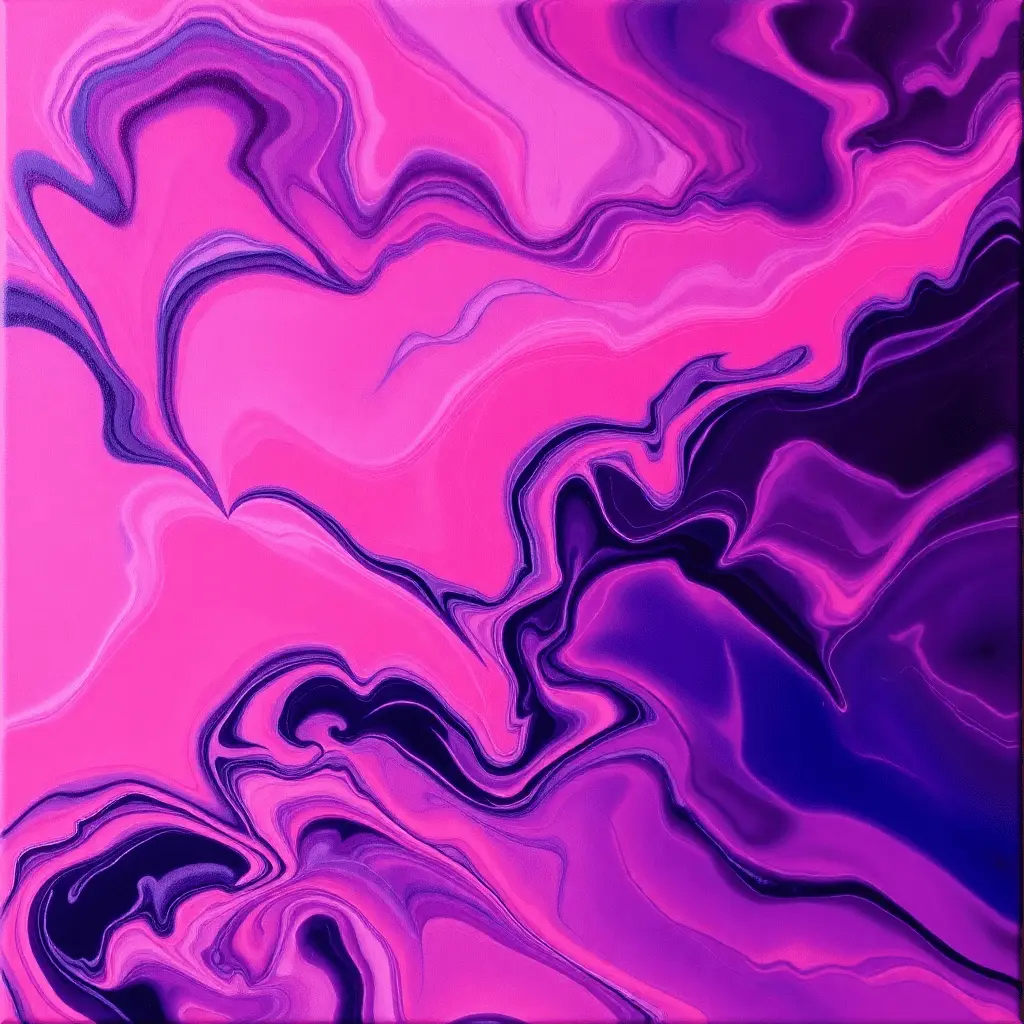
Combine a bright bubblegum pink with a rich indigo purple and add a small quantity of titanium white to create contrast and lift. Pour these colors into a single cup in alternating layers, then place your canvas face down on top of the cup, flip the whole setup quickly, and lift the cup away. Tilt the canvas slowly in all directions to guide the flow of paint across the surface. The results are always unique, always surprising, and almost always beautiful. Adding a small amount of silicone oil to one of your colors before pouring creates cells and bubbles that give the painting an organic, living quality.
3. Pink and Purple Floral Garden Painting
Nature provides the most obvious and satisfying home for pink and purple, and nowhere is this more true than in the world of flowers. Peonies, roses, lavender, wisteria, tulips, orchids, and wild violets all sit naturally within this color family. A floral garden painting gives you tremendous freedom, whether you prefer tight, realistic detail or loose, gestural brushwork.
Begin by blocking in a soft background wash of diluted lavender or pale blush to establish the overall mood of the piece. Then work from the back of the composition forward, painting the most distant flower clusters in softer, cooler tones and bringing the foreground blooms into richer, warmer pinks and deeper purples. This approach, called atmospheric perspective, creates a believable sense of depth.
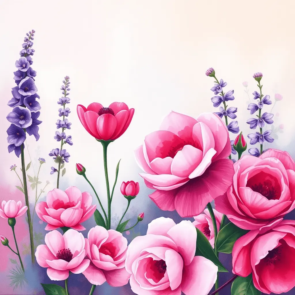
A palette knife loaded with thick pink paint can create stunning rose-like shapes with a single press, twist, and pull motion. Fine brushwork with a rigger brush can add stems, leaf veins, and the delicate detail of individual petals. The layering process is meditative and deeply satisfying, and the finished result carries a warmth and life that flat photographs of flowers rarely achieve.
4. Galaxy and Cosmic Night Sky
The galaxy painting style has become one of the defining art trends of the past decade, and for excellent reason. Real photographs of nebulae taken by space telescopes are dominated by glowing pinks, rich purples, and deep violets, making this subject a natural home for exactly this color combination.
Begin with a completely black background and allow it to dry thoroughly before touching it again. Using a dry fan brush or a torn piece of sponge, stipple on a base layer of deep Di oxazine Purple across the central area of your canvas. Work in soft, circular motions to build up the color without creating harsh edges. Then add a softer layer of magenta or warm pink within the core of the nebula, blending outward gently. Use a completely dry brush to smooth any transitions.
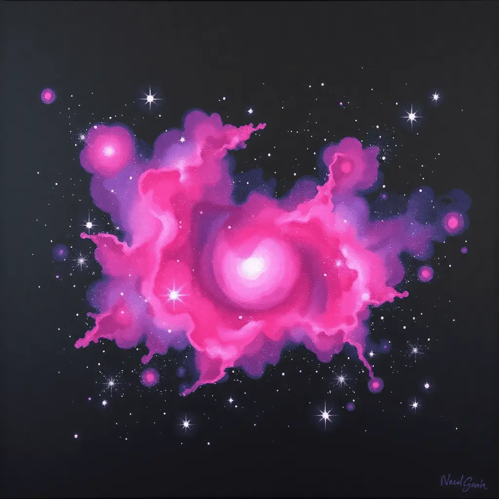
Once the nebula colors are established, load an old toothbrush with thinned white paint and run your thumb across the bristles to flick a spray of tiny stars across the entire canvas. Add a few slightly larger stars with the tip of a small round brush. The contrast between the rich glowing pinks and purples and the deep black background gives this painting an immediate, dramatic impact that works on any scale.
5. Pink and Purple Watercolor Wash
A loose watercolor wash is one of the most honest and meditative forms of painting. There is no pretense of control, and the results reward patience and a willingness to let the medium lead. Pink and purple washes feel poetic and delicate, and they have a quality of light that no other medium can fully replicate.
Saturate your watercolor paper with clean water using a large, soft brush. While the surface is still glistening, drop in concentrated rose pink pigment from a loaded brush and watch it bloom across the wet surface in soft, feathery clouds of color. Then add touches of deep violet or lavender at the edges and allow them to creep inward and mingle with the pink. Do not touch or stir the paint. Simply let the water carry it where it wants to go.
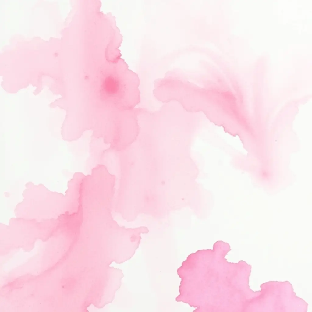
Once the wash is completely dry, you have a luminous, layered background that can be used as a standalone abstract piece or as the foundation for a botanical illustration, a portrait, or a fine-line ink drawing placed on top. These washes are widely used for greeting cards, art prints, and journal covers because they have a delicacy that feels both professional and deeply personal.
6. Butterfly Garden Scene
Butterflies carry an almost universal association with transformation, beauty, and joy, and when painted against a soft pink and purple backdrop, they produce one of the most uplifting and emotionally resonant paintings possible. The symmetrical wings of a butterfly also make them an unusually approachable subject for painters who feel less confident with organic shapes.
Start by blending a soft background in pale lilac and warm rose using a wide flat brush. Keep the edges soft and avoid harsh transitions. Once this background layer is dry, sketch the basic outline of one or more butterfly figures lightly onto the canvas with a pencil or chalk. Begin filling in the wing patterns with layered color, starting with the lightest tones and building toward the deeper, more saturated areas with subsequent layers.
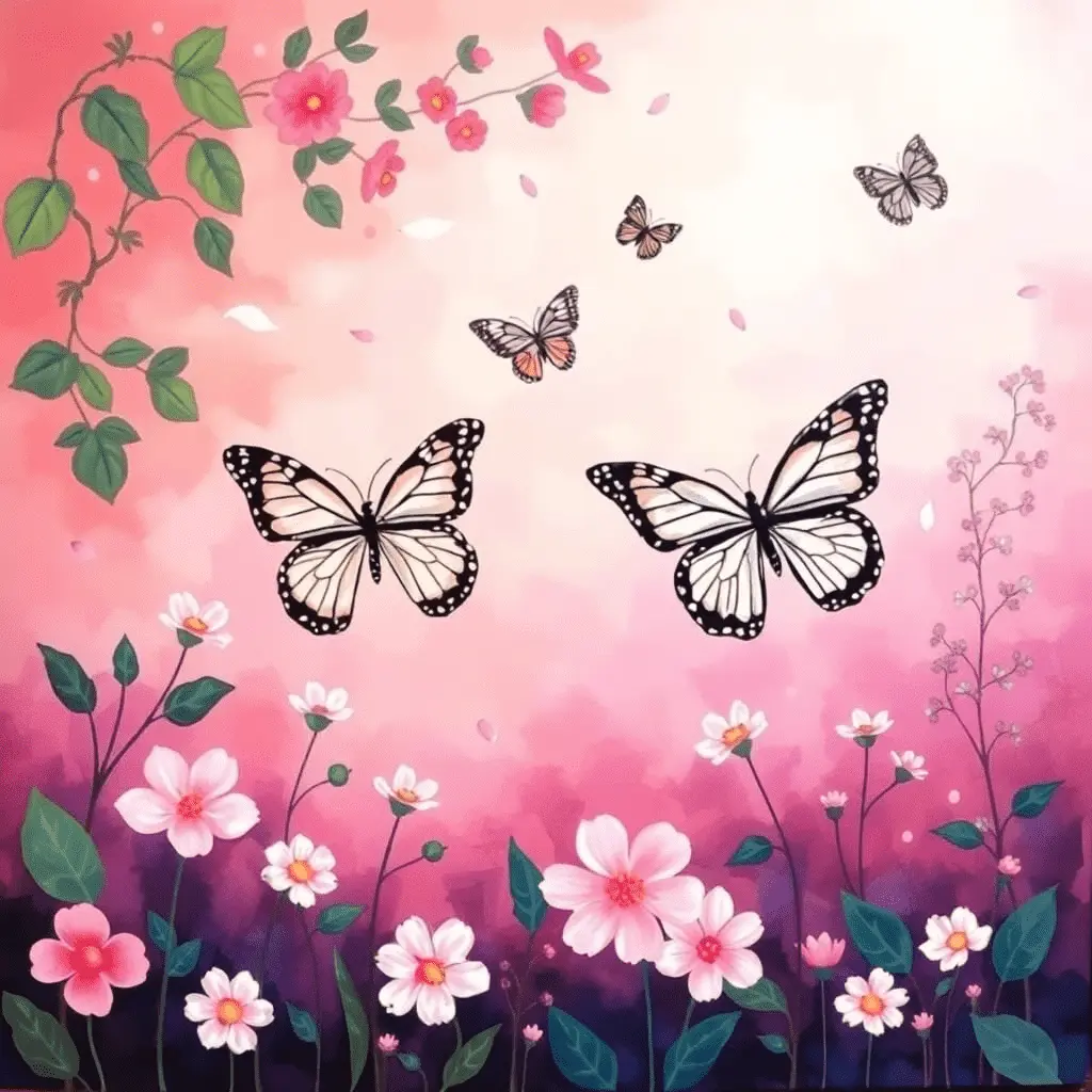
Adding small floral elements, scattered petals, or abstract foliage in the background adds depth and visual interest without competing with the butterflies themselves. A fine detail brush loaded with white paint can add veining to the wings and a sense of delicate structure that elevates the entire piece from decoration to genuine artwork.
7. Pink and Purple Ombre Wall Art
Ombre painting involves the smooth, graduated transition from one color into another across the surface of a canvas or wall, and the transition from deep purple into soft blush pink is one of the most popular and visually satisfying versions of this technique. The finished result has a modern, minimal quality that works exceptionally well in contemporary interiors.
Begin at the top of your canvas with a deep, rich violet mixed to full saturation. While this is still wet, introduce a mid-tone purple just below it and blend the two colors together with a clean, wide brush using long horizontal sweeping strokes. Continue working downward through mauve, lilac, and soft lavender before transitioning into a pale rose pink at the base of the canvas. The secret to a smooth ombre is keeping the blending zone wide and working quickly enough that the paint layers do not dry before you have the chance to merge them.

This technique can also be applied to a single large wall in a room for a dramatic interior design effect. Used as a canvas painting, the ombre provides an elegant, gallery-worthy background that can stand alone or support additional painted elements placed on top. https://finebrushes.com/blog/pink-and-purple-painting-ideas/
8. Misty Forest and Woodland Wonderland
A forest painted entirely in pink and purple tones creates an otherworldly, enchanted atmosphere that feels removed from everyday reality. Rather than painting a realistic green woodland, this approach shifts the entire color palette into the violet and rose family, transforming a familiar subject into something that feels mythological and strange.
Paint the most distant tree forms in the palest, coolest lavender tones, using very thin, diluted paint and soft edges to suggest mist and distance. As you work forward through the composition, gradually intensify the color and sharpen the edges of the tree forms. The nearest trees should carry the richest, most saturated purples and the most defined brushwork.
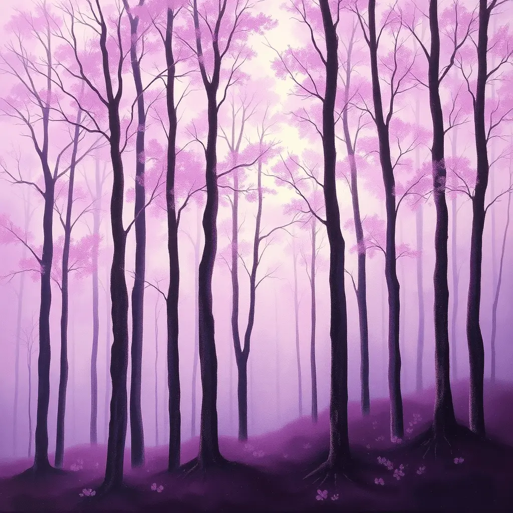
A soft pink or golden light filtering through the upper canopy can be suggested with careful dry brushing in a pale cream tone, pulled in short strokes downward between the tree trunks. This suggestion of filtered light gives the forest painting a magical, cinematic quality that makes it feel like an illustration from a story rather than a simple landscape.
9. Pink and Purple Cloudscape
A cloudscape puts the sky at the center of the composition and removes the ground entirely, forcing both the painter and the viewer to look upward and inward. Clouds lit by a setting or rising sun carry extraordinary amounts of pink, violet, and purple in their shadowed folds and glowing edges, making this subject an ideal home for the focus color palette.
Work on a canvas primed with a mid-tone background rather than pure white, as this gives your lighter cloud tones somewhere to push against. Use a dry fan brush or a soft sea sponge to dab on cloud shapes with layered, airy strokes. Begin with the deepest purple and violet tones in the upper and shadowed areas of the cloud formations. Then add brighter, warmer pink to the lower, lit edges of each cloud form, where the sunlight would be catching the base of the mass.
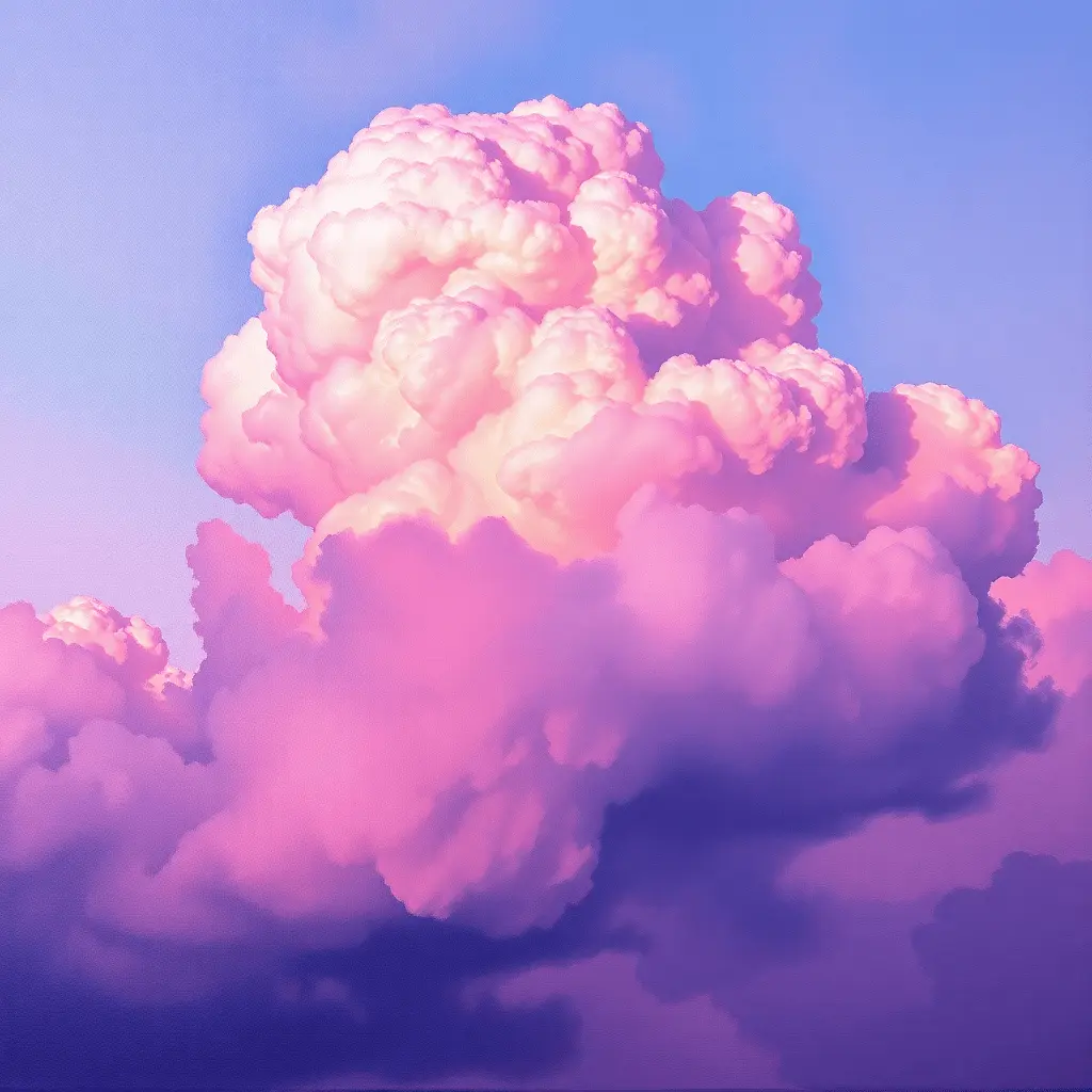
Small breaks of pale blue or cool grey between cloud formations add realism and provide the eye with rest between the warmer tones. The result is a painting that feels simultaneously dramatic and peaceful, and that captures the extraordinary light quality of a sky at its most expressive.
10. Mountain Range at Dusk
A minimalist mountain range painting in layered pinks and purples represents one of the most sophisticated and cleanly modern approaches to landscape painting available. Mountains are fundamentally geometric, defined by bold triangular silhouettes, and when those silhouettes are layered in receding tones from deep violet at the front to pale blush at the back, the sense of depth is immediate and convincing.
Use strips of masking tape to protect each completed mountain layer before painting the next. Begin with the most distant mountain range in the palest, most washed-out tone, barely darker than the sky itself. Allow this layer to dry completely before moving forward in the composition and deepening the color with each successive range. The foreground mountains should carry the richest, most saturated purples, creating a bold contrast with the pale distance.
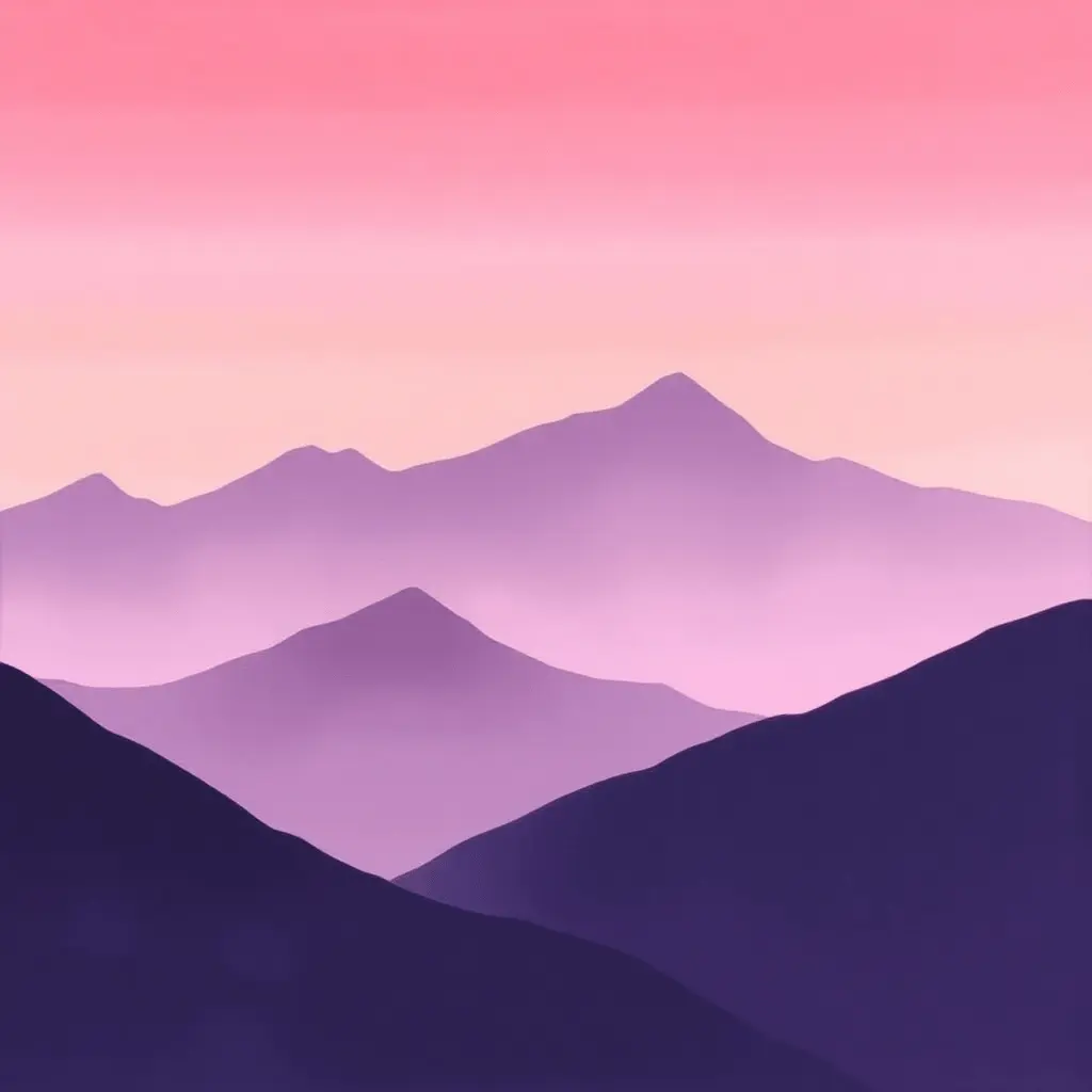
Paint the sky above in a warm gradient of soft rose and light orange fading into pale cream at the horizon. This warm sky against the cool mountain silhouettes creates a tension that makes the entire composition feel vibrant and alive. Remove all masking tape before the paint dries fully to avoid pulling the surface with you.
11. Pink and Purple Ocean Seascape
Most painters associate the ocean with blues and greens, but a seascape captured at the hour of sunset or under a rose-tinted dawn sky shifts the entire palette into the pink and purple family in a way that feels both surprising and completely believable. The water reflects whatever the sky offers, and when the sky burns with violet and magenta, the ocean answers in kind.
The most important technical principle in painting water is the horizontal brushstroke. The surface of the ocean is essentially flat, and every brushstroke that runs at an angle to the horizon will undermine the illusion of that flatness. Use long, sweeping horizontal strokes with a wide flat brush to lay in the main color areas of the water, keeping each stroke parallel to the horizon line.
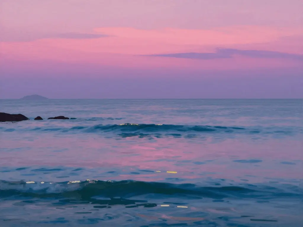
Where the sky glows with pink, reflect a slightly darker, more muted version of that tone in the water below. Add small horizontal highlights in white or pale yellow along the upper edges of wave crests to suggest light catching the surface. A simple silhouette of rocks, a distant headland, or a lone pier in the foreground can anchor the composition without requiring complex drawing skills or technical knowledge of marine architecture.
12. Fantasy Fairy Tale Landscape
Pink and purple have always been associated with magic, mystery, and the imagination, which makes them the perfect color family for a fantasy or fairy tale themed painting. This category of painting is the most liberating of all because it frees you entirely from the constraints of realism and invites you to invent the world you place on your canvas.
Begin with a rich, atmospheric background in deep violet and allow yourself to consider what kind of story you want the painting to tell. A glowing window in a distant tower, a winding path disappearing into glowing pink foliage, a moonlit lake reflecting a world of violet and rose, these are all storytelling elements that can be added gradually as the composition develops.
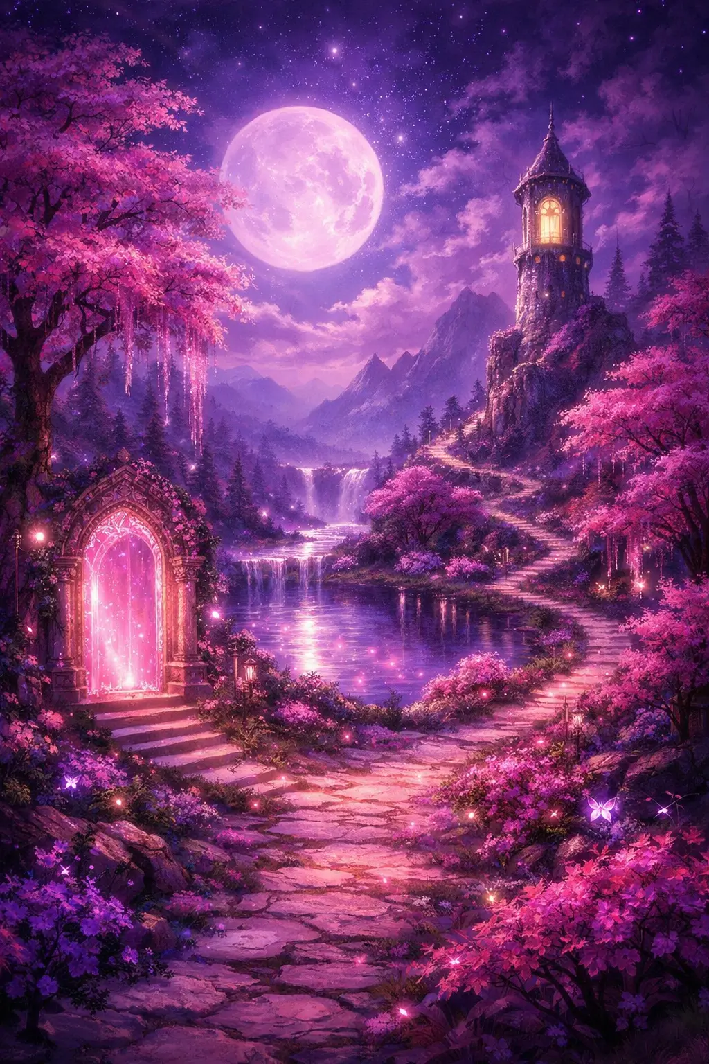
Strong light sources are the key to making a fantasy landscape feel alive and cinematic. A glowing moon, a magical doorway, or beams of pink light cutting through trees all create contrast and direct the eye through the painting in a way that feels intentional and dramatic. The more specific and personal the details you include, the more unique and memorable the painting will become.
13. Pink and Purple Geometric Abstract Art
Geometric abstract painting applies the pink and purple color family to a structured, architectural approach to composition. Clean lines, repeated shapes, and carefully considered color blocking create a graphic quality that looks striking and modern in any contemporary interior setting.
Apply strips of masking tape to your canvas in a deliberate geometric arrangement before you begin painting. Press the edges of the tape down firmly to prevent paint from bleeding underneath. Fill each geometric section with a different tone from your pink and purple family, placing deep indigo beside bright magenta, and surrounding both with pale lavender to balance the composition.

The moment you peel the tape away, you will see the painting snap into focus as the clean, precise edges are revealed. This controlled approach to abstract painting is particularly satisfying for people who love color and composition but prefer structure over the spontaneity of gestural or fluid techniques.
14. Lavender Field Painting
Lavender fields represent one of the most naturally beautiful and emotionally resonant subjects available to any painter working within the pink and purple palette. The repeated rows of lavender blooms stretching toward a warm horizon under a summer sky combine nearly every tone in the violet and rose spectrum within a single composition.
Use a small, slightly worn fan brush to suggest the soft, feathery texture of lavender flower spikes. Work in short, upward vertical strokes of violet, mauve, and lilac, alternating the tone slightly from one row to the next to add depth and prevent the field from looking flat. The rows nearest to the viewer should carry the deepest, most saturated color, while the rows closest to the horizon should fade into pale, almost grey-blue tones as they recede into the distance.
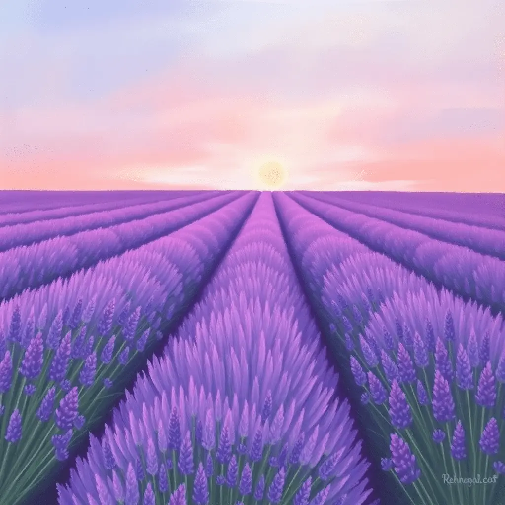
The sky above the lavender field should be kept deliberately simple to allow the richness of the field below to hold the viewer’s attention. A pale wash of blue with hints of warm pink near the horizon provides just enough visual interest to complete the composition without competing with the main subject.
15. Pink and Purple Moon and Stars Night Scene
A glowing moon surrounded by an aureole of soft pink and purple light against a deep night sky is one of the most quietly beautiful and atmospheric painting subjects available. This idea combines romance, mystery, and contemplative stillness in a way that few other subjects can match.
Begin with a background that is almost black but carries a very slight lean toward deep violet rather than a neutral grey black. This subtle color temperature in the background will harmonize beautifully with the glowing tones you add later. Paint the moon itself as a simple, clean circle in pale cream or warm white, keeping the edges slightly soft rather than perfectly sharp to suggest the way light diffuses at the lunar surface.
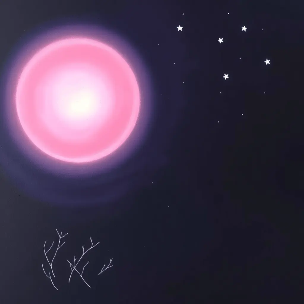
Using a very soft blending brush in circular motions, build up a halo of warm pink light immediately around the moon, then extend it outward into soft violet and finally into the deep surrounding darkness. The glow should fade so gradually that you cannot identify exactly where it ends. Scatter stars across the upper sky with a toothbrush and white paint and add a simple foreground of bare tree branches silhouetted in the lower portion of the canvas to give the composition a sense of grounded reality against all that ethereal light.
Conclusion
Pink and purple are two of the most emotionally intelligent colors in any painter’s palette. Together they speak a language that ranges from whispered softness to bold declaration, from dreamlike fantasy to grounded, realistic beauty. The 15 painting ideas explored in this article demonstrate just how wide and varied that language can be.
From the meditative simplicity of a watercolor wash to the technical layering of a galaxy nebula, from the structured geometry of masking tape abstraction to the free-flowing spontaneity of fluid art, every idea here offers something genuinely worth spending time on. You do not need to be an experienced artist to begin. You need a surface, a few colors, and the willingness to explore.
The most important thing is to pick one idea that appeals to you today and start. Every painting you complete in this color palette will teach you something new about how pink and purple behave together, how they blend, how they contrast, and how they light up a canvas with a quality of warmth and beauty that very few other combinations can achieve. That knowledge builds with every brushstroke, and the results will continue to surprise you.
Frequently Asked Questions
Q1. What paint medium works best for pink and purple painting ideas?
Acrylic paint is the most beginner-friendly choice because it dries quickly, cleans up with water, and works on nearly every surface. Watercolors produce softer, more luminous effects and are ideal for loose, flowing compositions. Oil paint offers slow-drying flexibility that is perfect for smooth, seamless blending across large areas.
Q2. How do you mix pink and purple without getting muddy results?
Always use a clean brush and a clean section of your palette when mixing. Pink and purple share a red base, which means they blend naturally without conflict. Muddy results typically come from introducing complementary colors such as green or yellow accidentally through a dirty brush. Keep your tools clean and work with small amounts of paint at a time.
Q3. Are these pink and purple painting ideas suitable for complete beginners?
Yes. Many of the ideas in this article, including the watercolor wash, the ombre canvas, the sunset landscape, and the fluid pour, require very little drawing ability and focus primarily on color blending and basic brush handling. These simpler starting points build confidence and technique quickly, and they all produce beautiful results even on a first attempt.
Q4. What canvas size is best for these painting ideas?
This depends on the subject. Landscapes and seascapes benefit from a wider horizontal canvas. Moon scenes and mountain ranges work well in a taller portrait orientation. Geometric abstract and floral paintings look great on square canvases. Beginners are well served by starting with a small 8 by 10 or 9 by 12-inch canvas, which keeps the project manageable and allows for more attempts in a shorter time.
Q5. Can other colors be added to a pink and purple painting without disrupting the palette?
Absolutely. White adds softness and luminosity across both tones. Black creates dramatic contrast and depth. Small amounts of gold or warm cream add richness and prevent the palette from feeling cold. Touches of blue or teal can be introduced carefully to cool areas of the composition. The key is to keep pink and purple dominant and use supporting colors sparingly so that the overall palette remains cohesive and intentional.