20 Best Ideas for Gray Paint Colors in Any Room
Introduction
Gray is one of those rare paint colors that never truly goes out of style. It sits at the perfect intersection of sophistication and restraint, offering a backdrop that complements virtually every furnishing style, material, and architectural detail. Whether you are drawn to a barely-there whisper of silver in a sun-drenched living room or a deep, moody charcoal in a cozy home office, the right shade of gray has the power to completely transform a space.
That said, choosing gray paint is far more nuanced than it appears. Walk into any paint store and you will find hundreds of gray options, each with its own personality shaped by undertones, depth, and the way it reacts to light. A gray that looks perfect on a sample chip can turn lavender, green, or even blue once it covers an entire wall. Understanding how undertones work, how natural light interacts with color, and which shade suits which room is what separates a beautiful result from a disappointing one.
This guide covers 20 of the best ideas for gray paint colors across every room in the home, drawing on designer-recommended shades and practical insights to help you make a confident, well-informed choice.
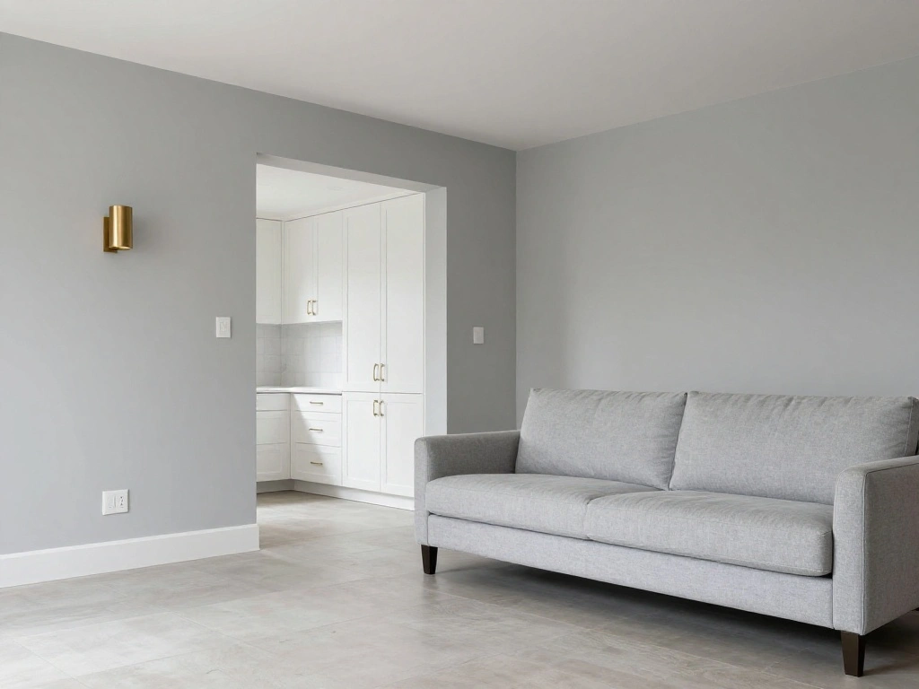
1. Agreeable Gray by Sherwin-Williams for Open Living Spaces
Agreeable Gray is arguably the most popular gray paint color sold in North America, and for good reason. It is a warm, greige-leaning shade that reads as a soft neutral in almost any lighting condition. It works beautifully in open-concept layouts where paint must flow seamlessly from one room to the next without clashing with varying light sources. Pair it with warm white trim and natural wood floors for a timeless, inviting result.
2. Repose Gray by Sherwin-Williams for a True Neutral Look
Repose Gray sits slightly cooler than Agreeable Gray, making it a true neutral that leans neither too warm nor too cold. It is one of the most versatile options available, performing well in living rooms, hallways, and bedrooms alike. In rooms with ample natural light, it can appear almost lavender. In warmer artificial lighting, it settles into a clean, soft gray. This color pairs exceptionally well with crisp white cabinetry and brushed nickel or chrome fixtures.
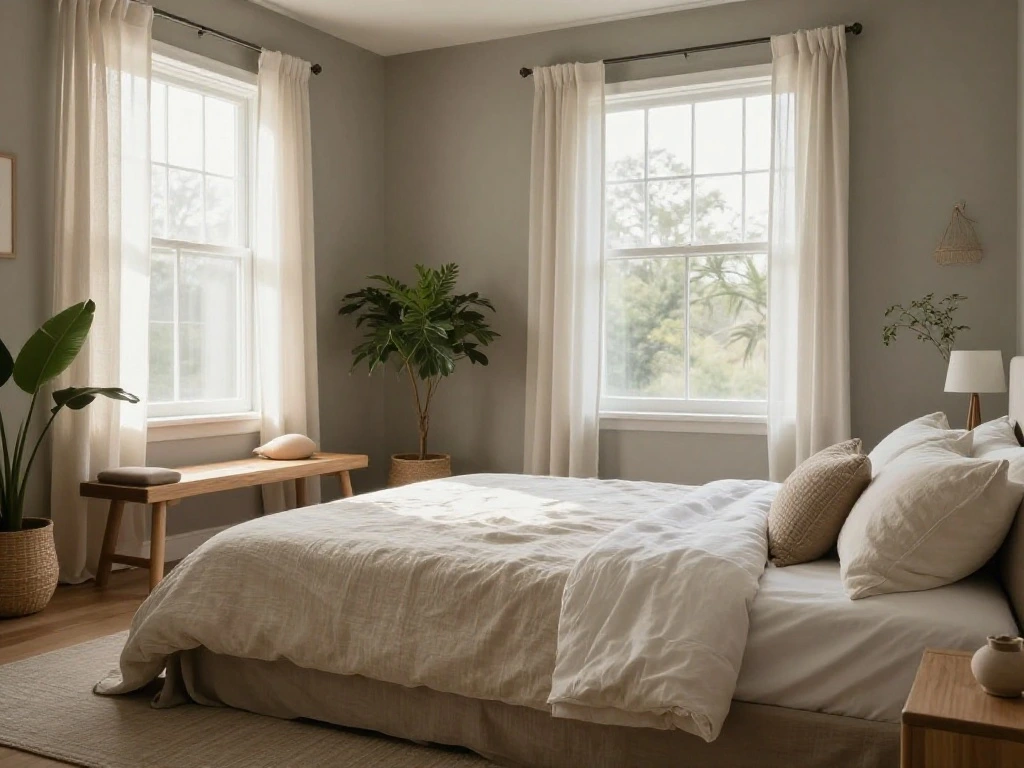
3. Gray Owl by Benjamin Moore for Light and Airy Bedrooms
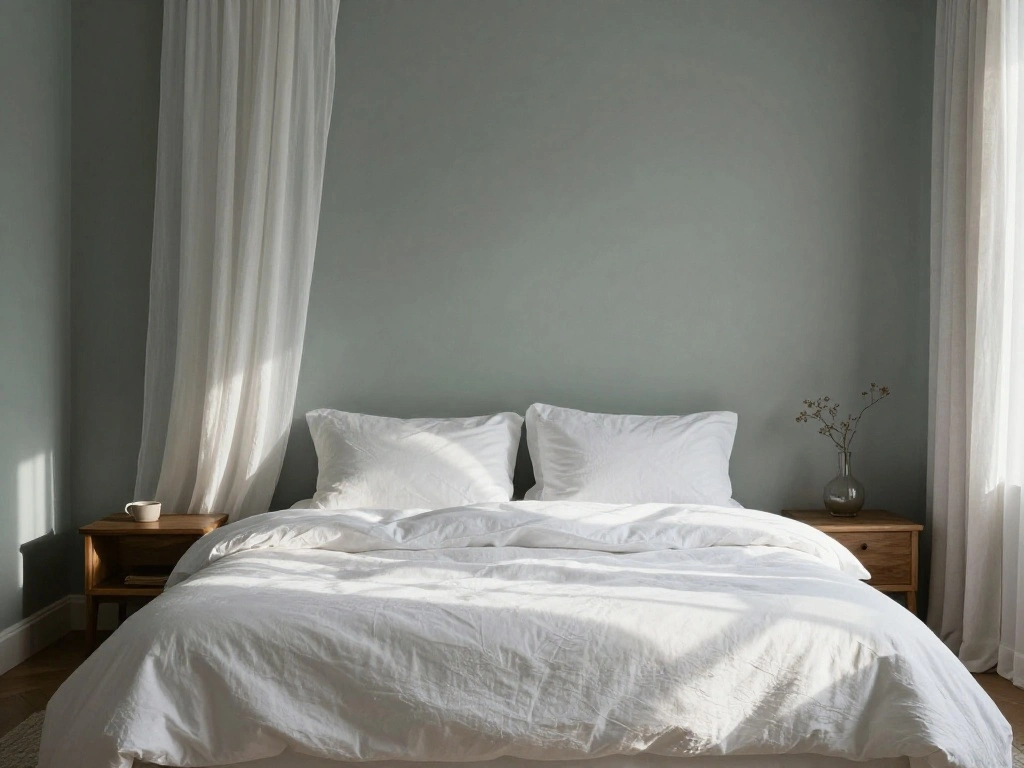
Gray Owl is a soft, slightly cool gray with the faintest green undertone that keeps it from reading blue. It has a clean, restful quality that makes it an excellent choice for bedrooms where the goal is calm and tranquility. Its relatively high LRV means it reflects light well without looking white, creating a subtle sense of depth that feels polished rather than washed out.
4. Balboa Mist by Benjamin Moore for a Soft, Elegant Feel
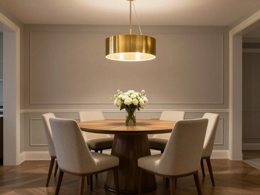
Balboa Mist occupies a beautiful territory between gray and greige. It is warm enough to feel cozy but neutral enough to read as a true gray in most lighting conditions. Interior designers frequently recommend it for dining rooms and master bedrooms because it has a certain quiet elegance that does not compete with artwork, furnishings, or natural materials. It pairs exceptionally well with cream, warm white, and soft gold accents.
5. Coventry Gray by Benjamin Moore for Traditional Interiors
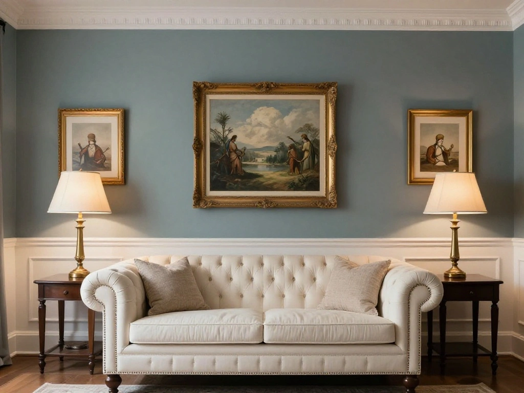
Coventry Gray is a medium-toned gray with a slightly blue-green undertone that gives it a classic, composed character. It works wonderfully in rooms with traditional architectural details such as wainscoting, crown molding, and paneled doors. It is deep enough to feel intentional without being overwhelming, making it a reliable choice for formal living rooms and studies.
6. Wickham Gray by Benjamin Moore for Bright, Contemporary Spaces
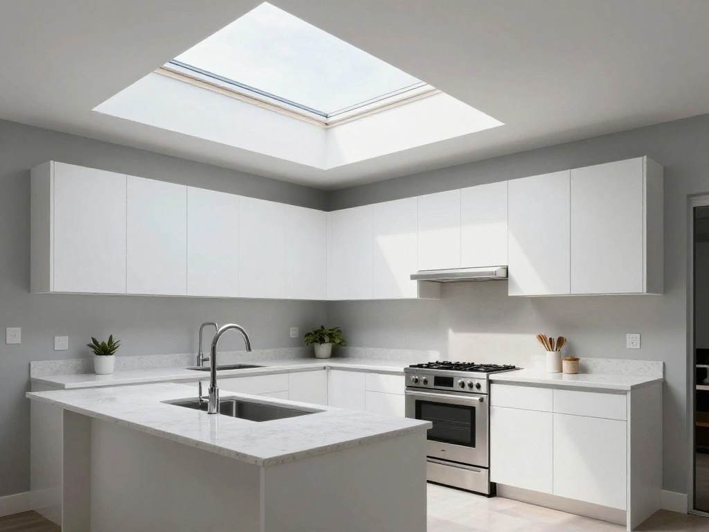
Wickham Gray is a light, cool-toned gray with soft blue undertones that make it feel crisp and modern. It is an excellent alternative to stark white in rooms with generous natural light, adding dimension without darkening the space. Use it in contemporary kitchens, open-plan living areas, or bathrooms where you want a clean, airy aesthetic without the harshness of pure white.
7. Revere Pewter by Benjamin Moore for Warm, Inviting Rooms
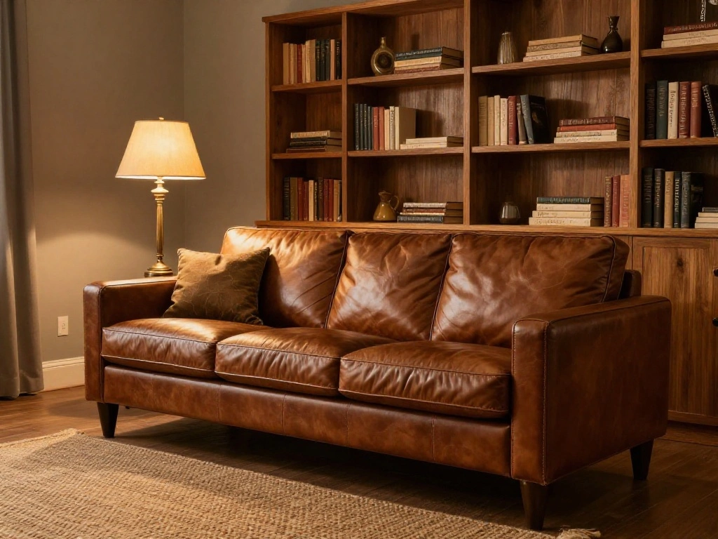
Revere Pewter has been a bestseller for decades, and it remains a go-to recommendation for designers working with warm-toned interiors. It sits at the intersection of gray, beige, and khaki, making it an ideal choice for rooms filled with wood tones, leather furnishings, and warm metals like brass and copper. It can shift noticeably depending on the light, sometimes reading more green or more brown, so always test it in your specific room.
8. Drift of Mist by Sherwin-Williams for a Barely-There Look
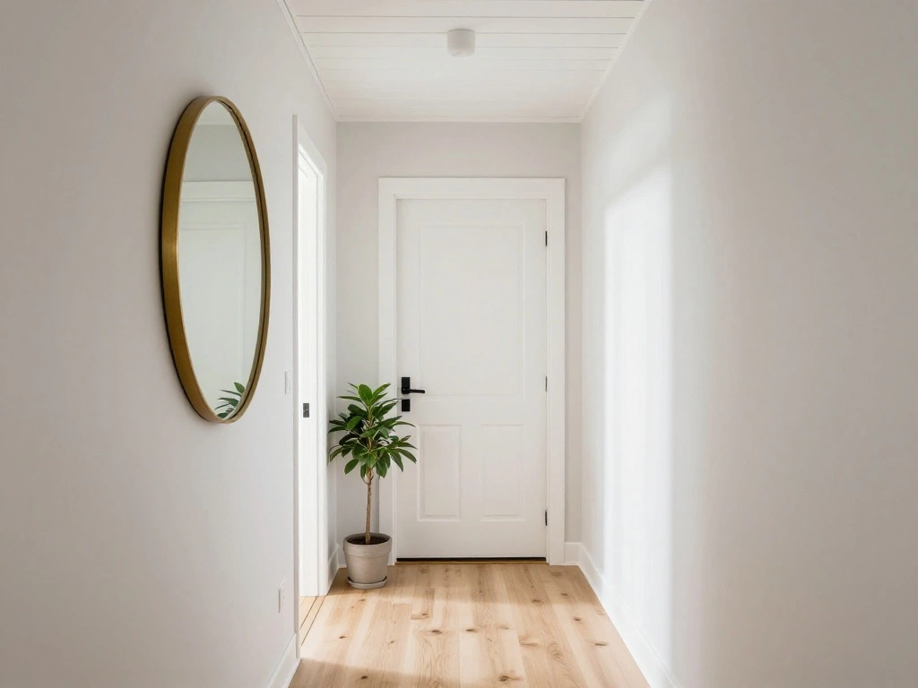
Drift of Mist is an extremely light warm gray that reads almost like an off-white in bright rooms. It is ideal for open kitchens, entryways, and transitional spaces where you want a cohesive, barely-there neutral that holds everything together without drawing attention to itself. Its subtlety makes it one of the best choices for whole-home painting projects where consistency across varying light conditions is important.
9. Mindful Gray by Sherwin-Williams for a Balanced Whole-Home Neutral
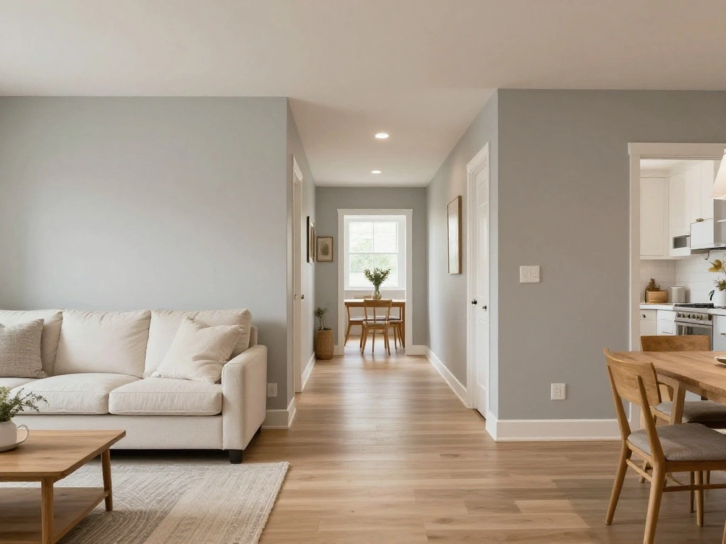
Mindful Gray strikes a careful balance between warm and cool undertones, making it one of the most adaptable gray paint colors available. It does not lean definitively in any direction, which means it performs consistently across different rooms and exposures. It is an excellent candidate for open-floor-plan homes where the paint color must transition through spaces with different natural light.
10. Classic Gray by Benjamin Moore for Subtle Sophistication
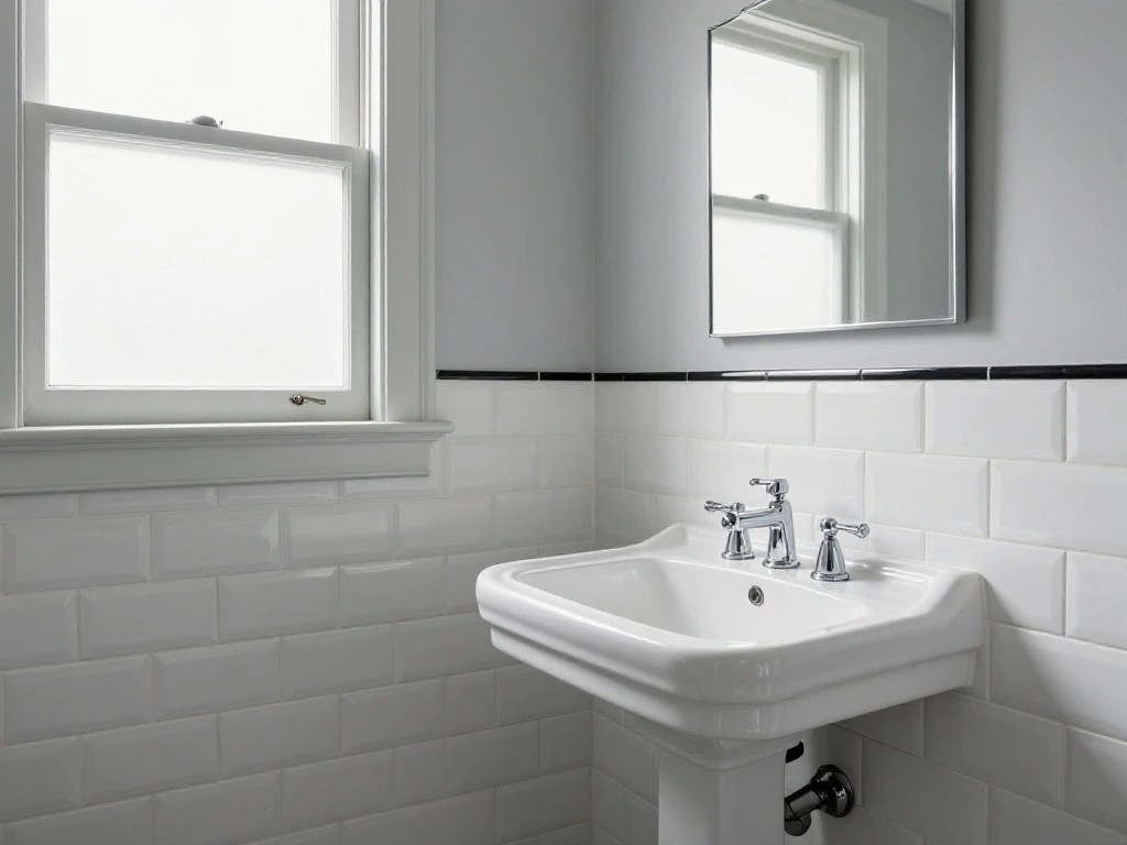
Classic Gray lives up to its name. It is a very pale, cool-leaning gray that creates a soft, airy backdrop in almost any room. In bathrooms, it provides a timeless contrast against white subway tile and natural stone. In bedrooms, it creates a serene, spa-like quality. Its LRV is high enough that it never feels heavy, making it an excellent choice for spaces with lower ceilings or limited natural light.
11. Iron Mountain by Benjamin Moore for Dramatic Accent Walls
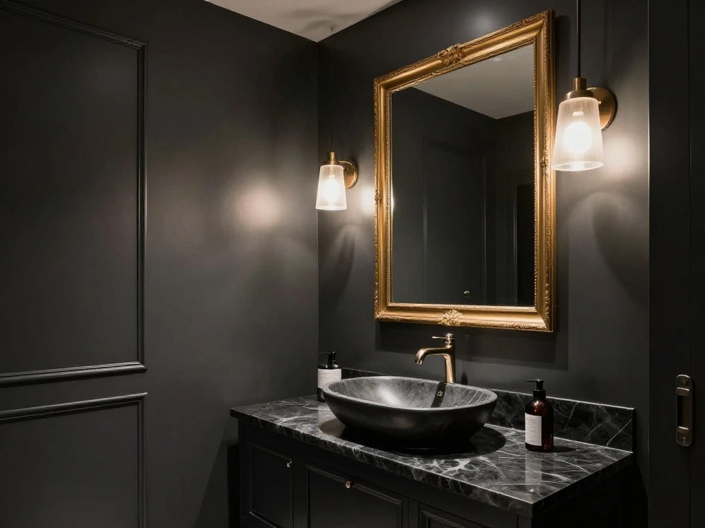
Iron Mountain is a deep, rich dark gray that sits close to charcoal without tipping into black. It delivers drama and sophistication in spaces that can handle a bold statement. A powder room, a fireplace surround, or a built-in bookcase painted in Iron Mountain creates an immediate focal point. In a high-gloss finish, it adds a layer of luxury that few other colors can match.
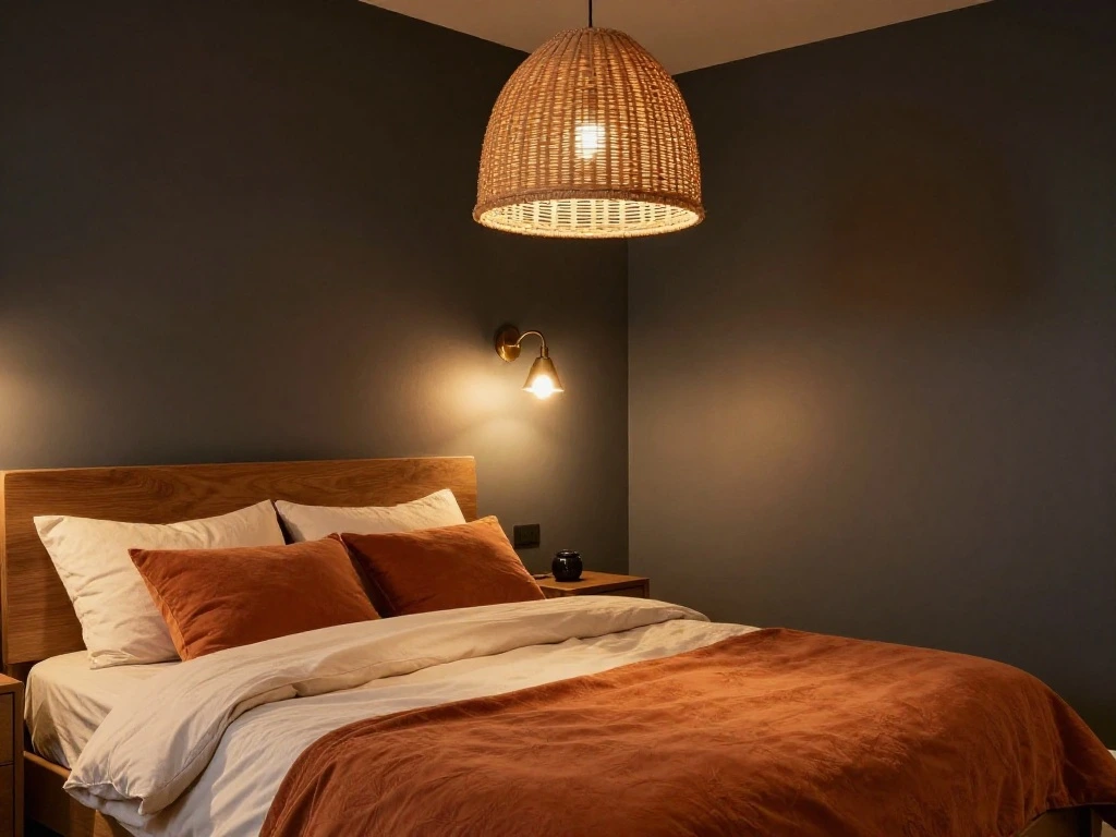
12. Wrought Iron by Benjamin Moore for Moody, Sophisticated Spaces
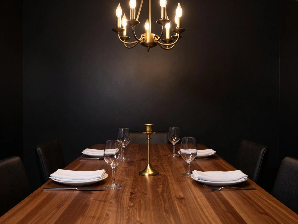
Wrought Iron sits at the edge of gray and near-black, delivering the kind of depth that makes a room feel layered and intentional. It works beautifully as a kitchen cabinet color paired with brass hardware and a white marble countertop, or as an all-over color in a dining room where you want the space to feel intimate and enveloping. Its slightly warm undertone prevents it from feeling cold or stark.
13. Forged Steel by Sherwin-Williams for Contemporary Kitchens
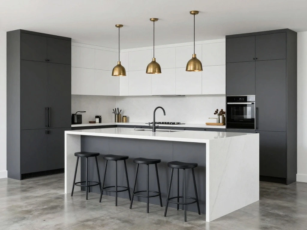
Forged Steel is a true neutral dark gray that pairs equally well with cool and warm accents, making it an especially flexible option for kitchens. It works on lower cabinets paired with lighter upper cabinets, on a kitchen island, or as an all-over wall color in an open cooking space with high ceilings. Its versatility across different hardware finishes, from matte black to polished chrome, makes it a practical and stylish choice.
14. Galveston Gray by Benjamin Moore for Earthy, Organic Interiors
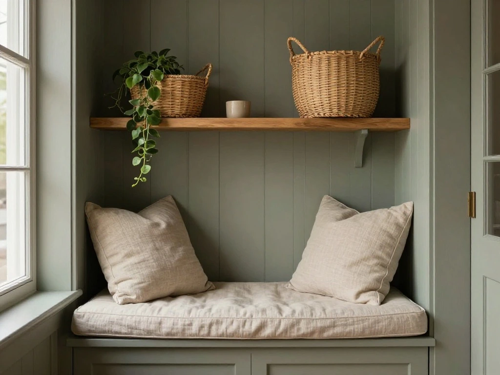
Galveston Gray is a mid-tone gray inspired by coastal shale, featuring a subtle green undertone that gives it a grounded, organic quality. It works particularly well in smaller spaces like kitchen pantries, powder rooms, and reading nooks where the depth of the color contributes to a feeling of intimacy. It pairs naturally with wood tones, rattan, linen, and other materials found in nature-inspired interiors.
15. Platinum by Behr for a Silvery, Polished Finish
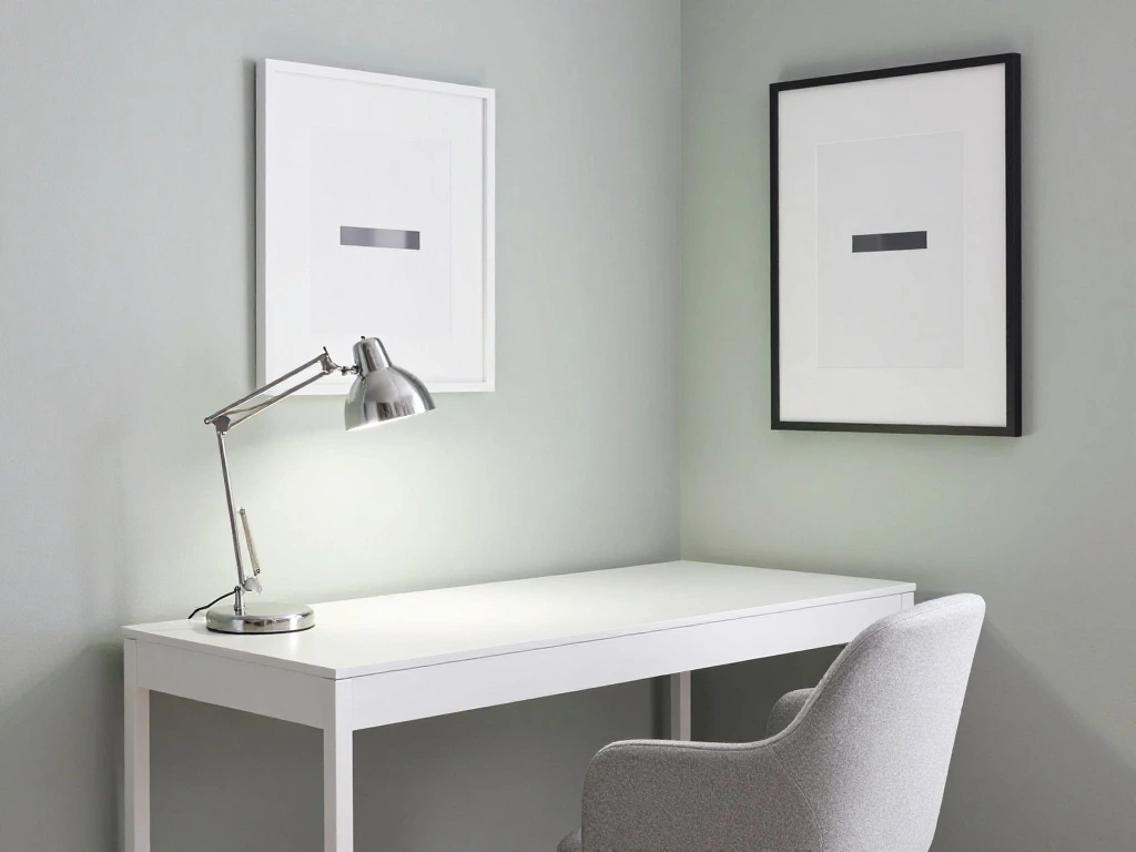
Platinum is a pale gray with silvery green undertones that give it a clean, almost luminous quality. In rooms with modern or contemporary furniture and metallic accents, it creates a polished, gallery-like atmosphere. It works well in home offices, studios, and living areas where clarity and focus are priorities. Pair it with white trim and chrome or stainless-steel accessories for a cohesive, refined look.
16. Chic Gray by Behr for Versatile Mid-Tone Coverage
Chic Gray is a versatile mid-tone gray with warm beige notes that keep it from feeling clinical. It is well-suited to transitional-style homes where the aesthetic sits somewhere between traditional and contemporary. Its warmth makes it approachable for bedrooms and family rooms, while its gray base keeps it from looking too casual or earthy for more formal spaces.
17. Cracked Pepper by Behr for Bold, Statement-Making Rooms
Cracked Pepper is an elevated dark gray with a warm, almost bronzed undertone that makes it feel richer than a standard charcoal. It earned recognition as a Color of the Year for its effortless versatility alongside warm creams, deep browns, and crisp whites. It is an excellent choice for dining rooms, master bedrooms, and accent walls where a strong, confident color is the goal. For more insights.
18. Porch Swing by Farrow and Ball for a Sophisticated Muted Look
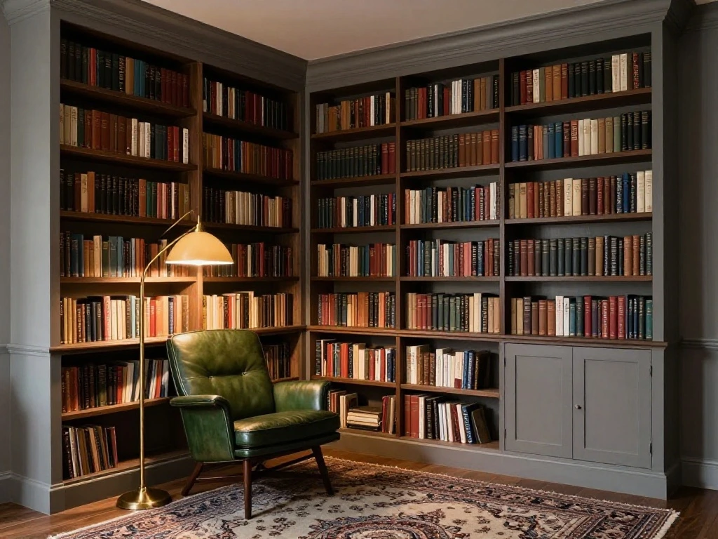
Farrow and Ball is known for producing grays with extraordinary depth and complexity, and this warm mid-tone gray is no exception. It sits comfortably in rooms with natural materials like linen, aged wood, and stone, adding a sense of refined restraint. It works beautifully in libraries, sitting rooms, and studies where the goal is a quietly intellectual atmosphere.
19. Elephant Breath by Farrow and Ball for Rich, Layered Rooms
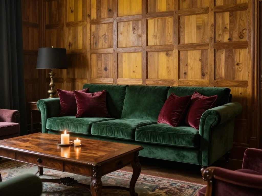
Elephant Breath is a warm, mid-tone gray with pronounced yellow-brown undertones that give it a unique, complex character. It feels simultaneously masculine and cozy, making it an interesting choice for dining rooms, home offices, and living areas with wood-paneled walls or rich upholstery. It pairs naturally with deep, saturated accent colors like forest green, burgundy, and navy.
20. Natural Gray by Behr for Calming Bedrooms and Wellness Spaces
Natural Gray is a modern gray with a sophisticated taupe touch that inspires peace and serenity. Its soft, approachable quality makes it one of the best gray paint colors for bedrooms, meditation spaces, and bathrooms designed around rest and relaxation. It pairs effortlessly with natural linen, soft cotton whites, and warm wood tones to create a tranquil, wellness-oriented environment.
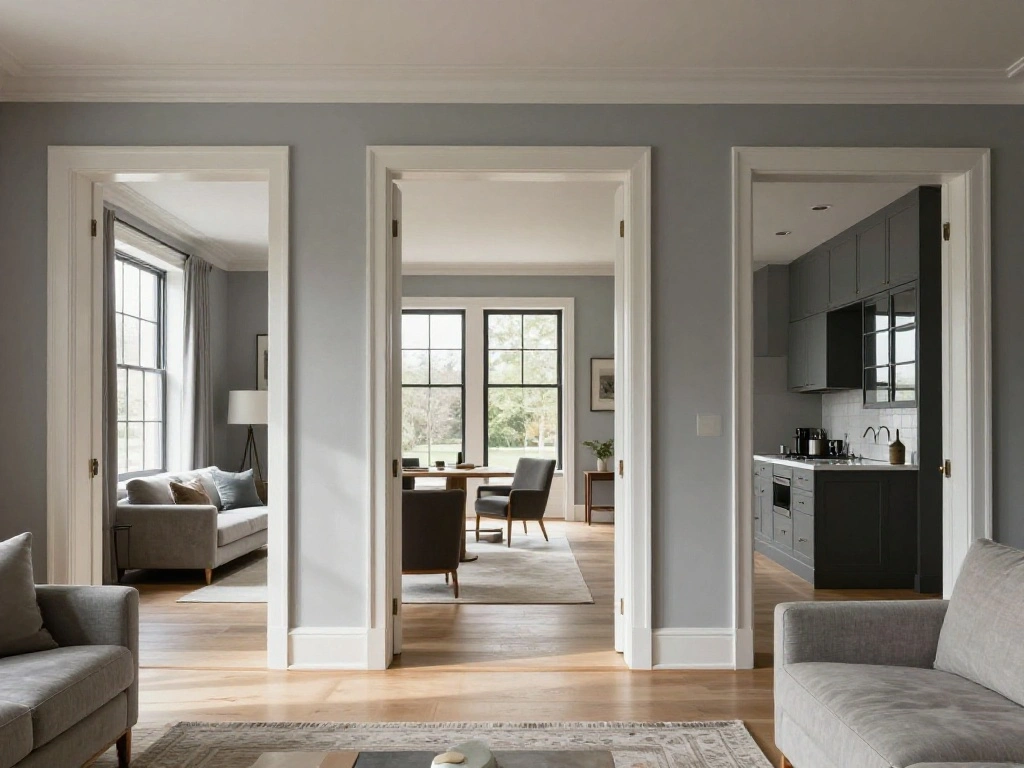
How to Pair Gray Paint with Other Colors
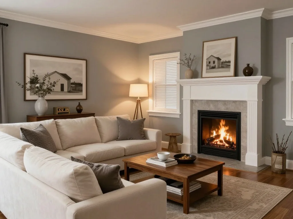
Gray is one of the most accommodating neutrals in the color spectrum. Light grays pair naturally with crisp whites, soft creams, and pale blush tones for an airy, Scandinavian-inspired look. Mid-tone grays work beautifully alongside navy blue, forest green, and deep burgundy for a classic, layered interior. Dark grays hold their own against warm gold, brass, terracotta, and rich wood tones.
White trim is almost always a safe companion to any shade of gray, but choosing the right white matters. Warm whites like Benjamin Moore’s White Dove complement warm grays, while cool, crisp whites like Chantilly Lace work better alongside cool-toned grays with blue or green undertones.
Conclusion
Gray paint colors offer an extraordinary range of possibilities, from the palest, barely-there silver to the deepest, most enveloping charcoal. The key to choosing the right shade lies in understanding your room’s natural light, identifying the undertone that works best with your existing finishes, and selecting a finish that suits the practical demands of the space. Whether you are drawn to the warm comfort of Agreeable Gray, the timeless sophistication of Coventry Gray, or the bold confidence of Cracked Pepper, there is a perfect gray for every room in your home. Take your time, test your samples, and trust the process. When gray paint is chosen thoughtfully, the results can be genuinely transformative.
Frequently Asked Questions
1. What is the most popular gray paint color?
Agreeable Gray by Sherwin-Williams consistently ranks as one of the top-selling gray paint colors in North America. Its warm, greige character makes it highly adaptable across different lighting conditions, architectural styles, and furnishing palettes. Repose Gray by Sherwin-Williams and Gray Owl by Benjamin Moore are also perennial bestsellers among designers and homeowners.
2. What is the difference between warm gray and cool gray?
Warm grays contain undertones of beige, brown, or taupe, making them feel inviting and grounded. Cool grays draw from blue, green, or violet undertones and tend to feel more crisp and contemporary. The best choice depends on your room’s light exposure, your existing finishes, and the mood you want to create.
3. Can gray paint work in a small room?
Yes, and it often does so beautifully when chosen correctly. Light grays with a high LRV can make a small room feel larger by reflecting available light. Darker grays, used intentionally in small spaces like powder rooms or reading nooks, can create a feeling of intimate, enveloping coziness rather than making the space feel cramped.
4. How does room lighting affect gray paint?
Lighting has a profound effect on how gray reads on walls. North-facing rooms with cool, indirect light will intensify blue and green undertones in gray paint. South-facing rooms with warm light tend to make gray look softer and more balanced. It is important to test paint samples on your actual walls and observe them at multiple times of day, including in both natural and artificial light.
5. What trim color works best with gray walls?
White trim is the most classic and reliable companion to gray walls. The key is matching the warmth or coolness of your trim to your wall color. Warm grays pair best with warm whites like White Dove or Chantilly Lace in softer tones, while cool grays look sharp alongside brighter, crisper whites. A small amount of contrast between the wall and trim helps define the architecture of the room without competing with the overall color scheme.